Homes
Amazing
Stakeholder:
Role:
UI Designer
CareerFoundry UI Design Project
Duration:
3 Months
Tools:
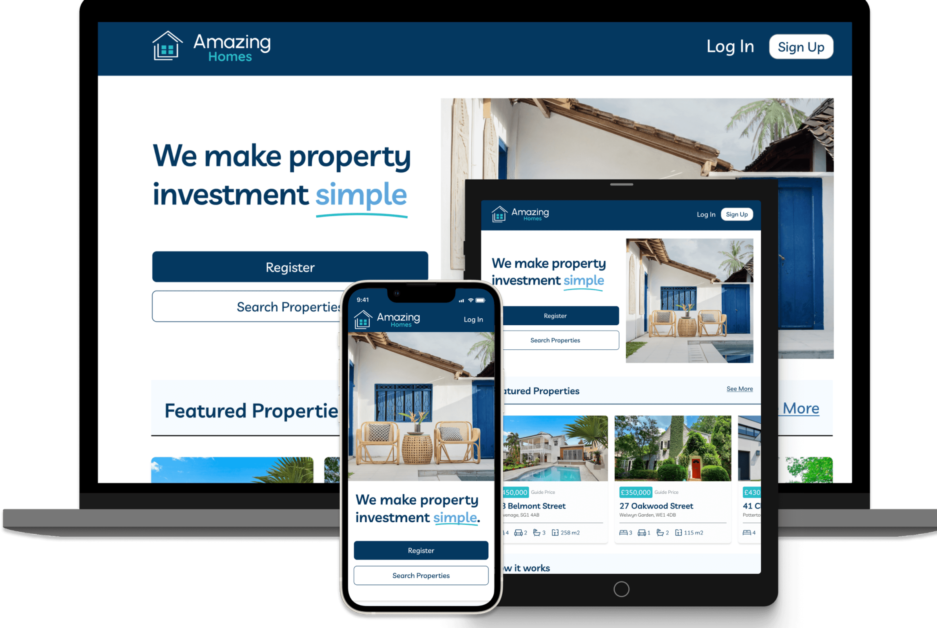
A responsive web app that simplifies the process of property investment.
Real estate investment is an increasingly popular way for individuals to achieve financial security. It is an exciting and emotional experience, but often complicated.
First-time property buyers often struggle to find reliable, comprehensive information to make informed investment decisions, leading to uncertainty and potential financial risk.
Amazing Homes is responsive web application that provides first-time property buyers with a user-friendly interface, offering comprehensive, reliable information and tools to evaluate investment properties effectively, thereby reducing uncertainty and financial risk.

Project Brief
User Personas
User Stories
User Flows
Low-fi wireframes
Mid-Fi Wireframes
Final Mockups
Prototype
Responsive Web App Design
Mood Board
Style Guide
My Design Process
Define
Ideate
Design
Refine
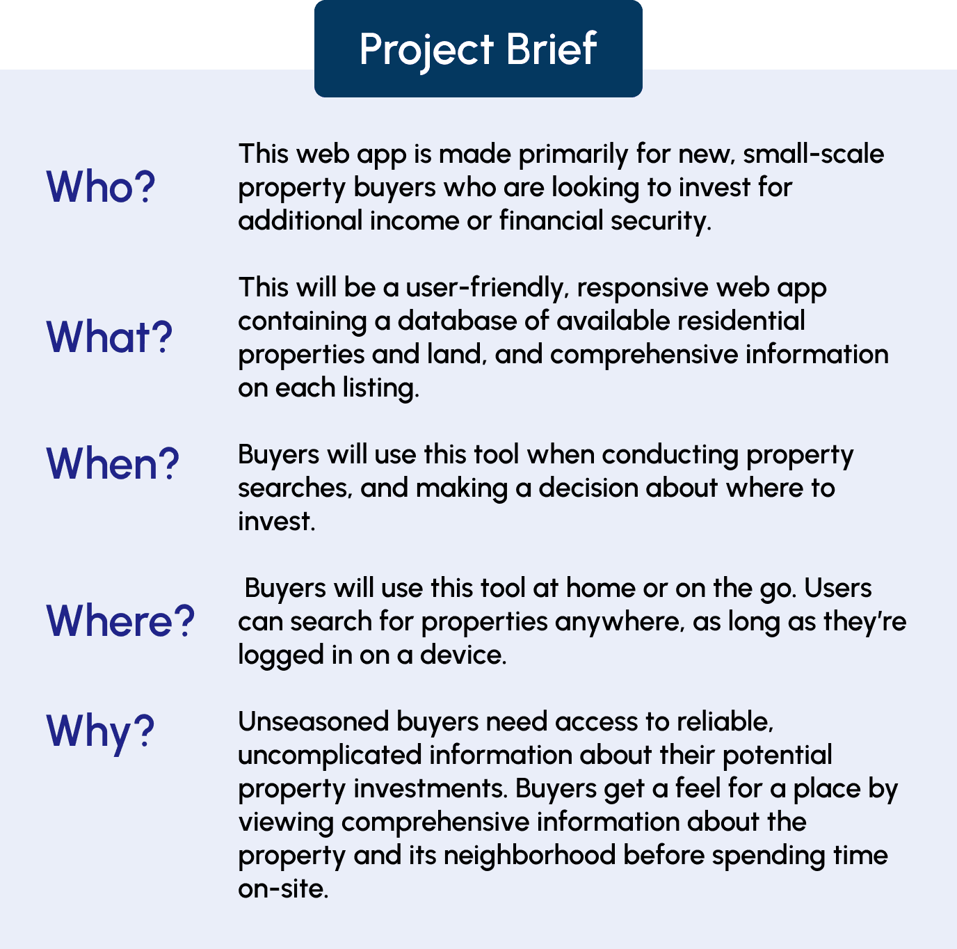
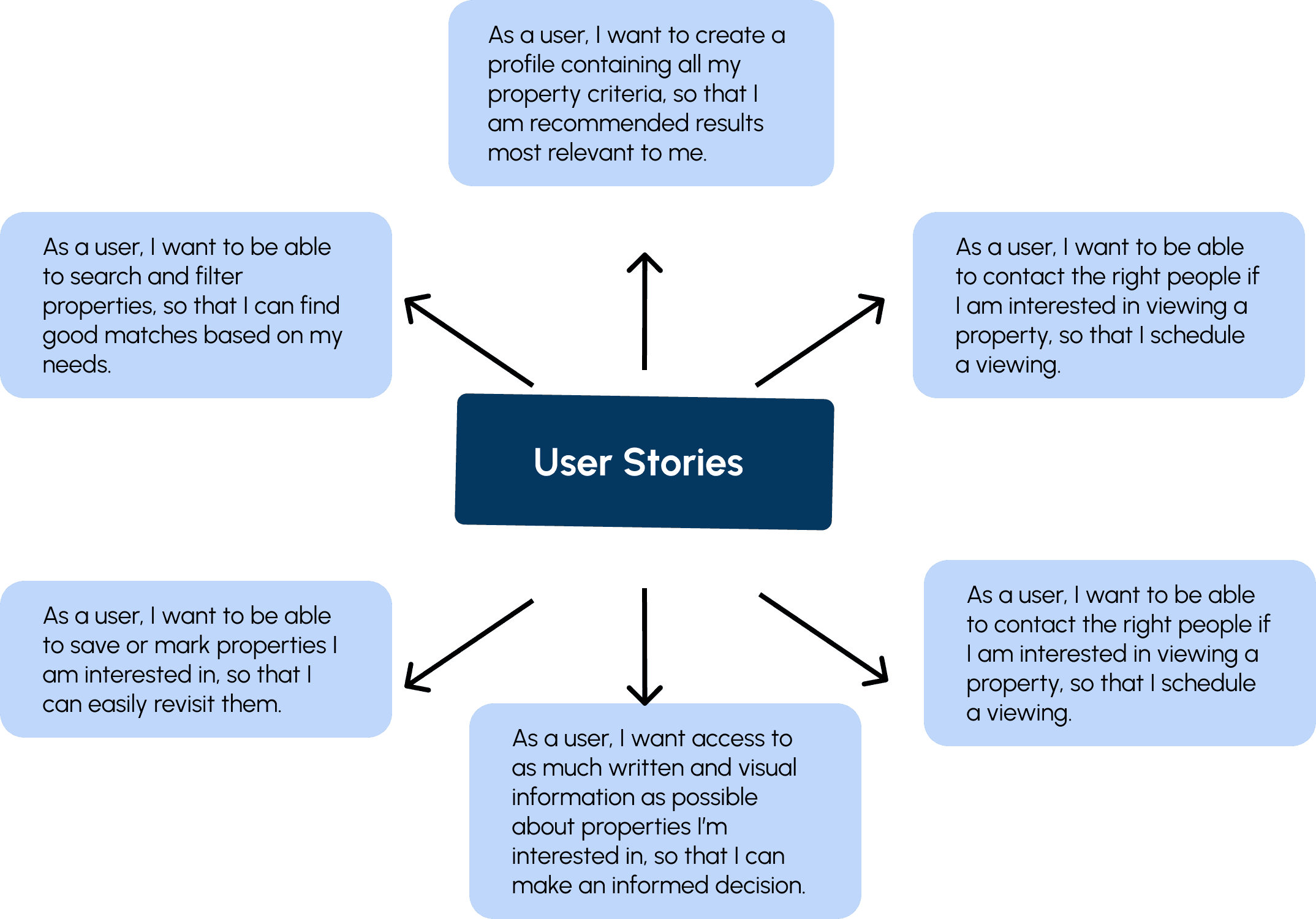
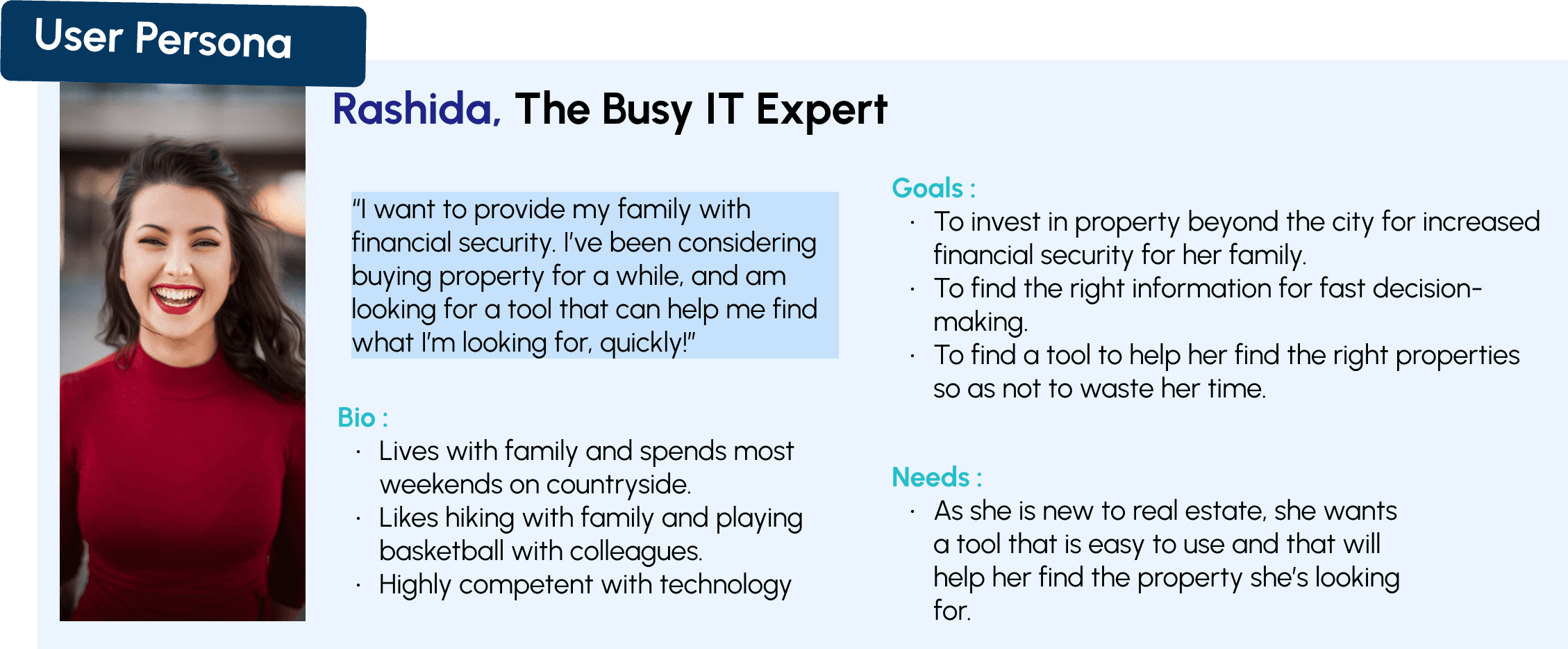
Who is this for?
What am I trying to solve?
First, I analysed the project brief and made sure that I fully understand the persona and her user stories. This helped me prioritise the features to be included in the app.
Define
Ideate
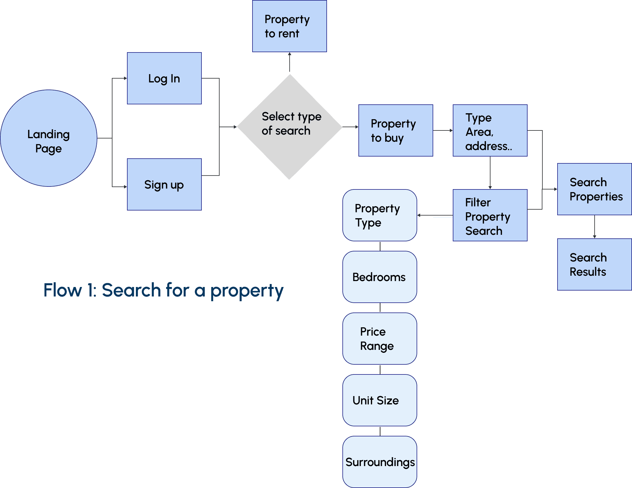
Next, I created userflows to visualise how the user would navigate through the app.
User Flow
Next, I brainstormed and sketched my ideas on pen and paper. Once I finalised the layout of the main features and functionalities of the app, I digitalised my sketches and turned them into mid-fidelity wireframes for usability testing and further iterations.
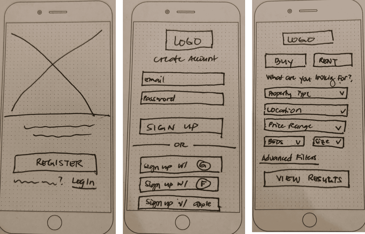
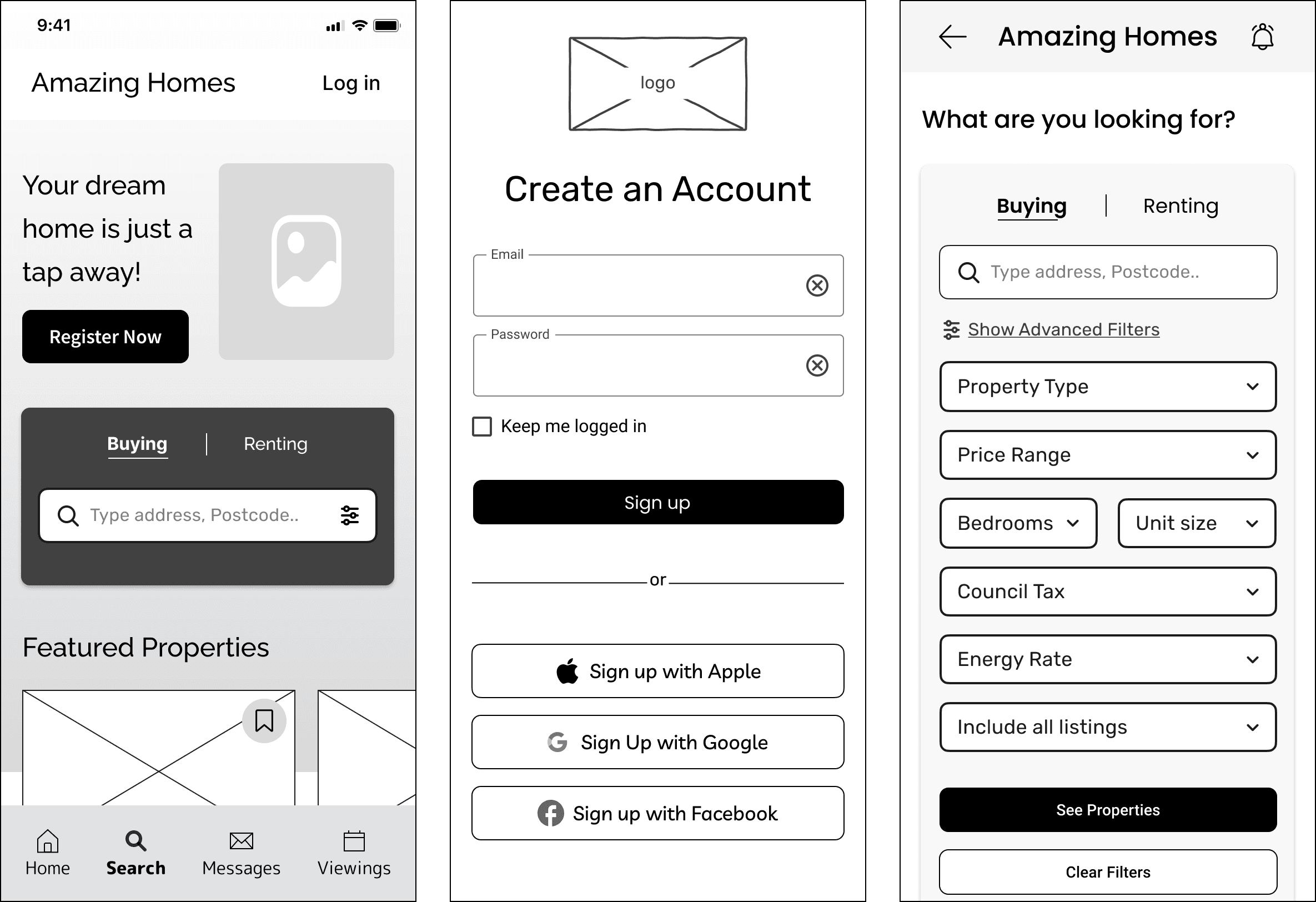
Landing Page
Sign-up Page
Search Page
Mid-Fidelity
Landing Page
Sign-up Page
Search Page
Low-Fidelity
Design
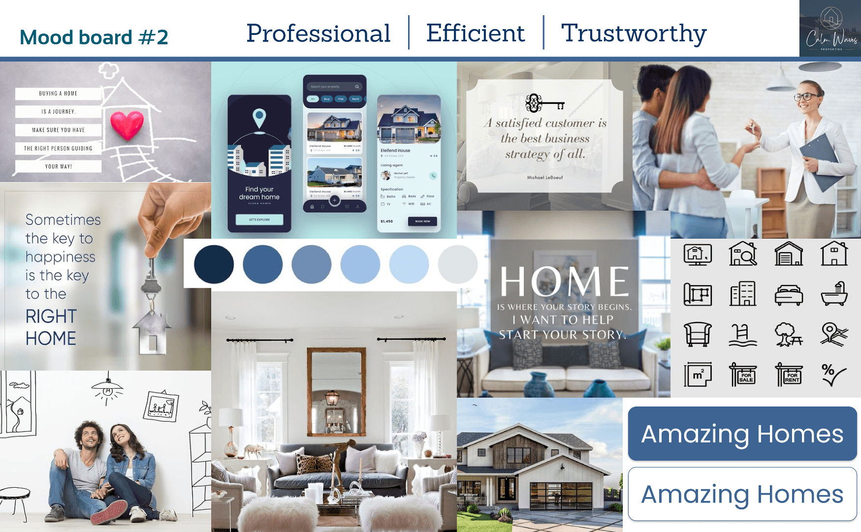
I created 2 mood boards for design inspiration. I chose this mood board because I thought it resonated more with the mood and tone that I wanted the brand to convey to the users. It evokes a feeling of calmness, trust, professionalism, modernity and simplicity.
Style Guide
I chose my colour palette based on my mood board and played a bit with the shades of blue. I also opted for a mixture of pastel and bright accents to catch attention and make the elements more interesting.
Colour Palette
#043860
#173E77
#E6F4FF
Primary
#BFD7FA
#25BEC8
Accents
#FFFFFF
#FDFDFD
#173E77
#D9D9D9
#737D8C
#49454F
Neutrals
Typography
Header
Body / Copy
Livvic
Merriweather
ABCDEFGHIJKLMNOPQRSTUVWXYZ
ABCDEFGHIJKLMNOPQRSTUVWXYZ
ABCDEFGHIJKLMNOPQRSTUVWXYZ
ABCDEFGHIJKLMNOPQRSTUVWXYZ
Regular
Regular
Medium
Medium
Semi-bold
Bold
Bold
It has a distinct stroke that adds character and a modern feel to the typeface which is perfect as a header to attract attention.
The curve gives a bit of contrast to the headline and is a very good choice for a copy in terms of readability.
Logo + Wordmark
Amazing
Homes
Dark
Logo
Light
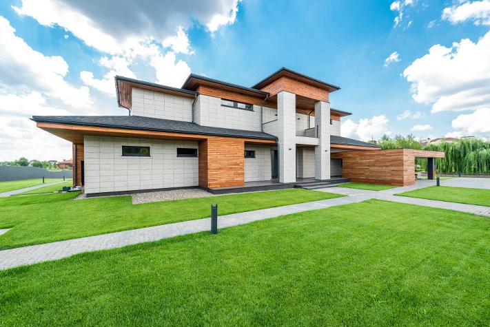
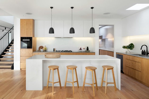
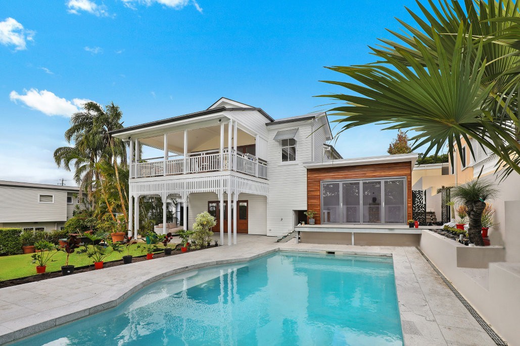
I used images that have clear focus, have good lighting, and are relevant to the brand.
Images

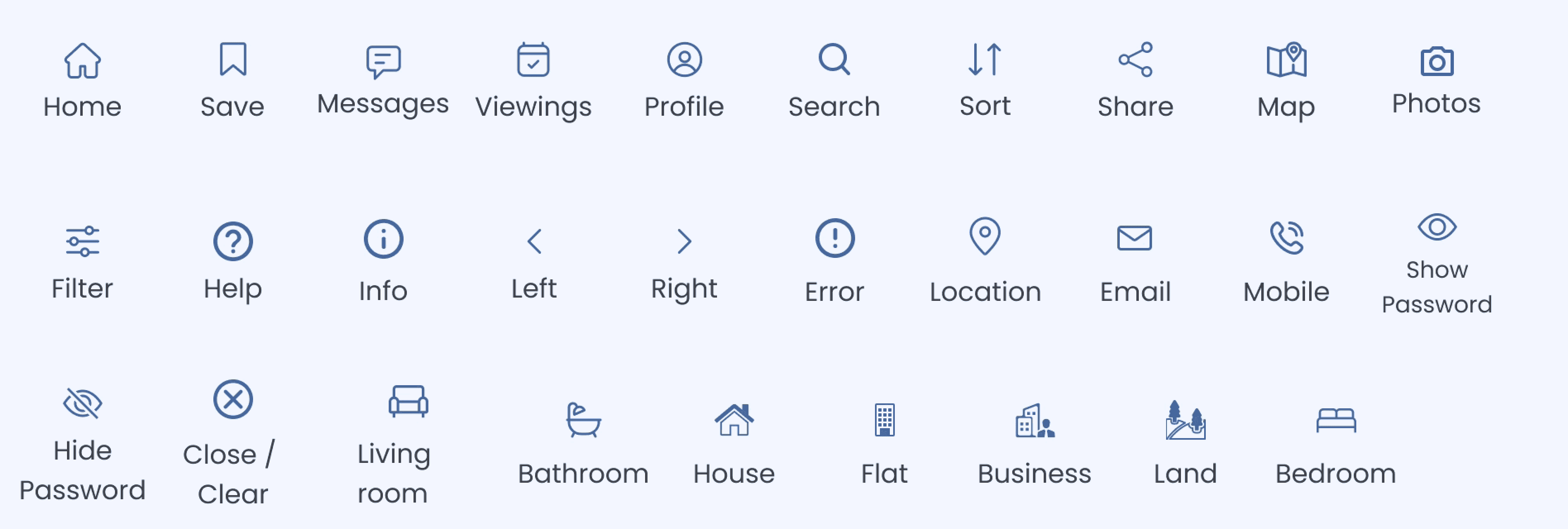
I used Icons and symbols that are common and familiar to the users to make it easier for them to navigate the different screens of the app
Iconography
UI Elements
Since I’m designing for a mobile-first approach, I used elements that allowed me to save space without compromising the size of the content, such as sliders and tabs. I also used colours to differentiate the state of the elements to provide feedback to the users when such actions are taken.
Buttons
Primary ( Enabled )
Selected
Secondary
Disabled
0 0
50
100
150
200
250
300
350
400
450
500
m2
£
0
50K
100K
150K
200k
250k
300k
350k
400k
450k
500k
550k
Label
£
0
50K
100K
150K
200k
250k
300k
350k
400k
450k
500k
550k
Label
Single
Double
Sliders
Tabs
Buy
Rent
Map
History
Tools

Guides
A Guide to First-time buyers
13 mins read
252px
307px
118px
Aspect Ratio
4 : 3
252 x 189
343px
£450,000
Guide Price
18 Belmont Street
Stevenage, SG1 4AB
4
2
3
258 m2
Aspect Ratio
16:9
343 x 193
375px
193px
182px
Cards
Form Fields
Error Message
Label
Error
Label
Focused
Label
Enabled
Calendar Picker
August
mo
tu
we
th
fr
sa
su
1
2
3
4
5
6
7
8
9
10
11
12
13
14
15
16
17
18
19
20
22
23
24
25
26
27
28
29
30
31
Navigation Bar
Selected
Unselected
Home
Saved
Viewings
Messages
Search Bar
Type area, address,...
Cam
Cambridge
10 results
Campbelltown
32 results
Camberley
20 results
Cambridge
Refine
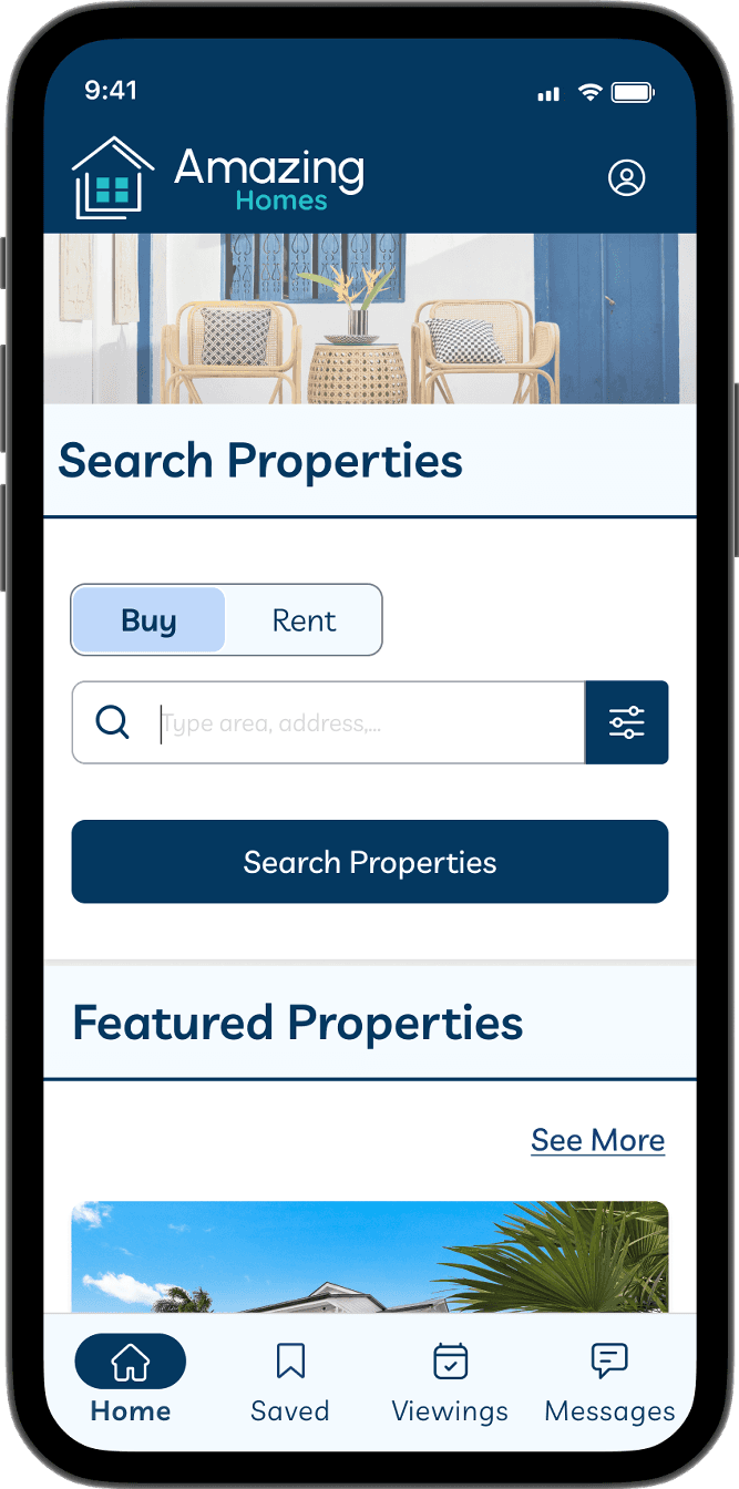
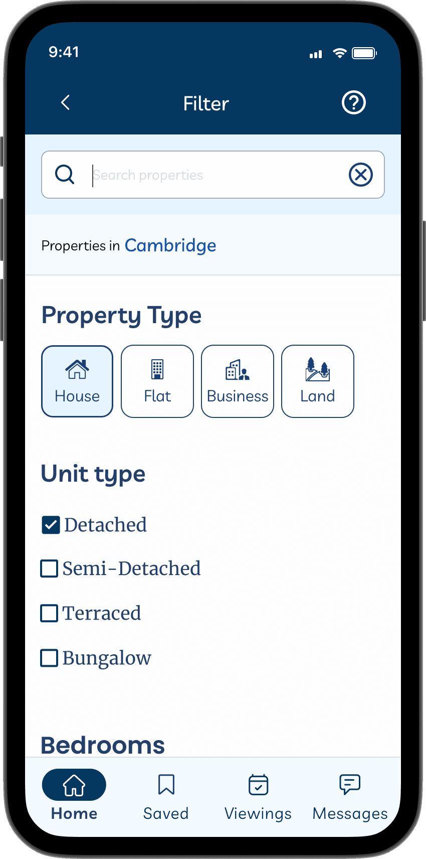
Landing Page
Sign up Page
Home page
Filter Page
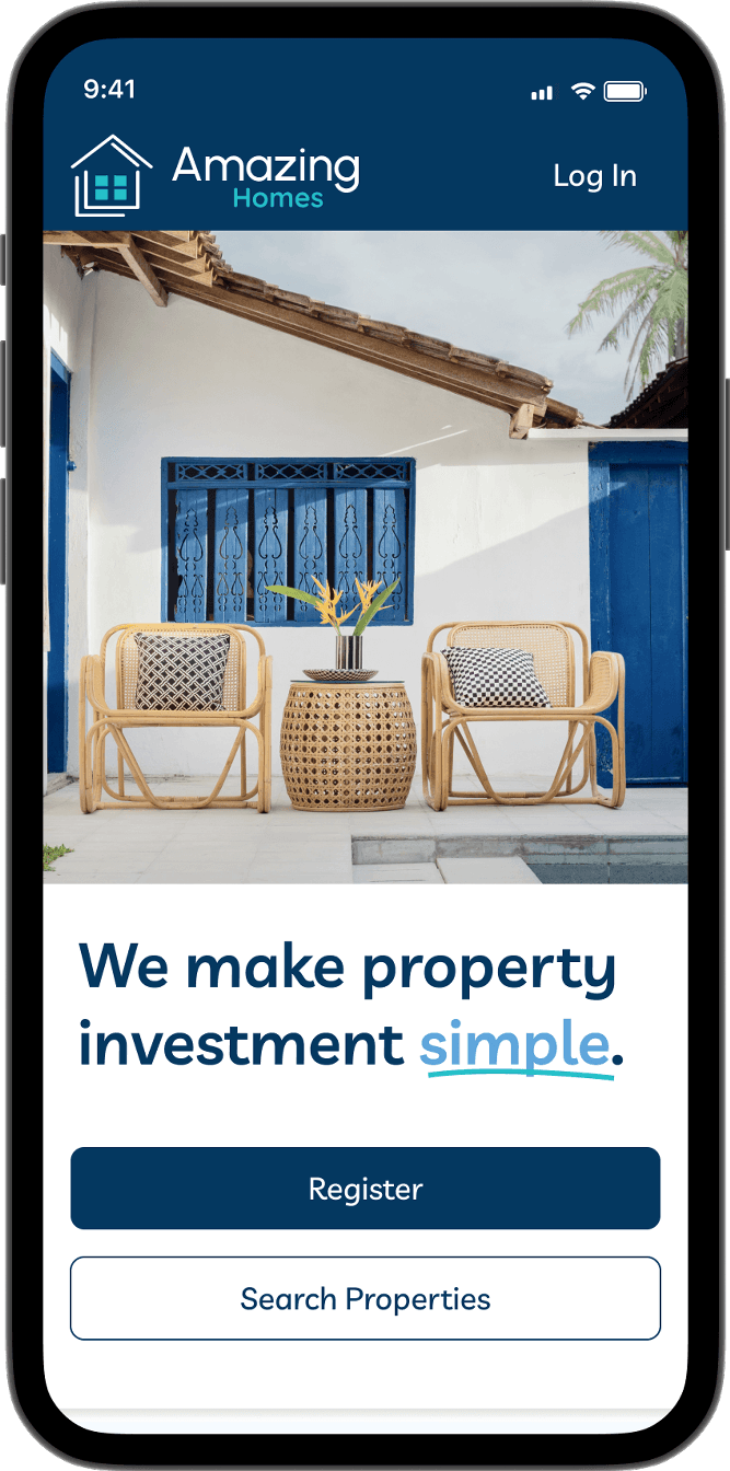
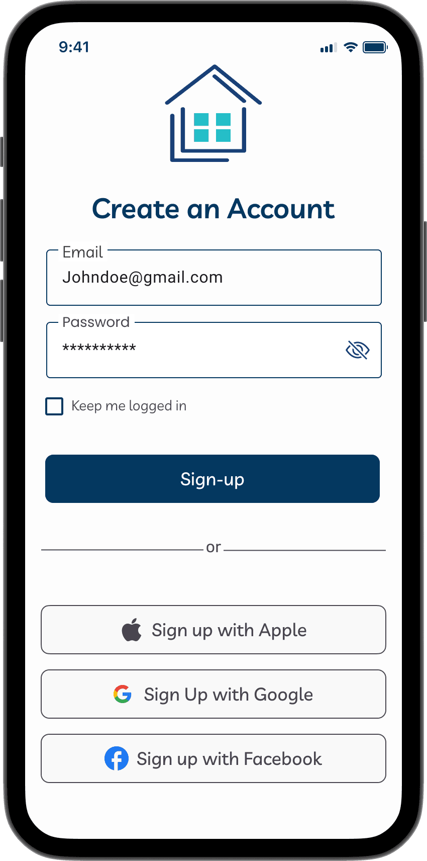
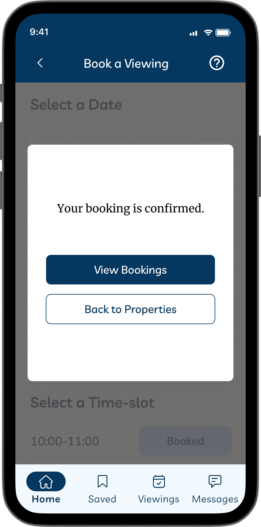
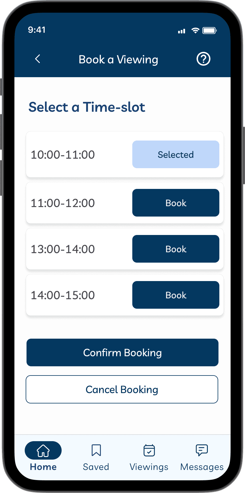
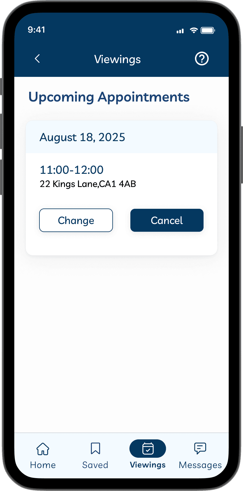
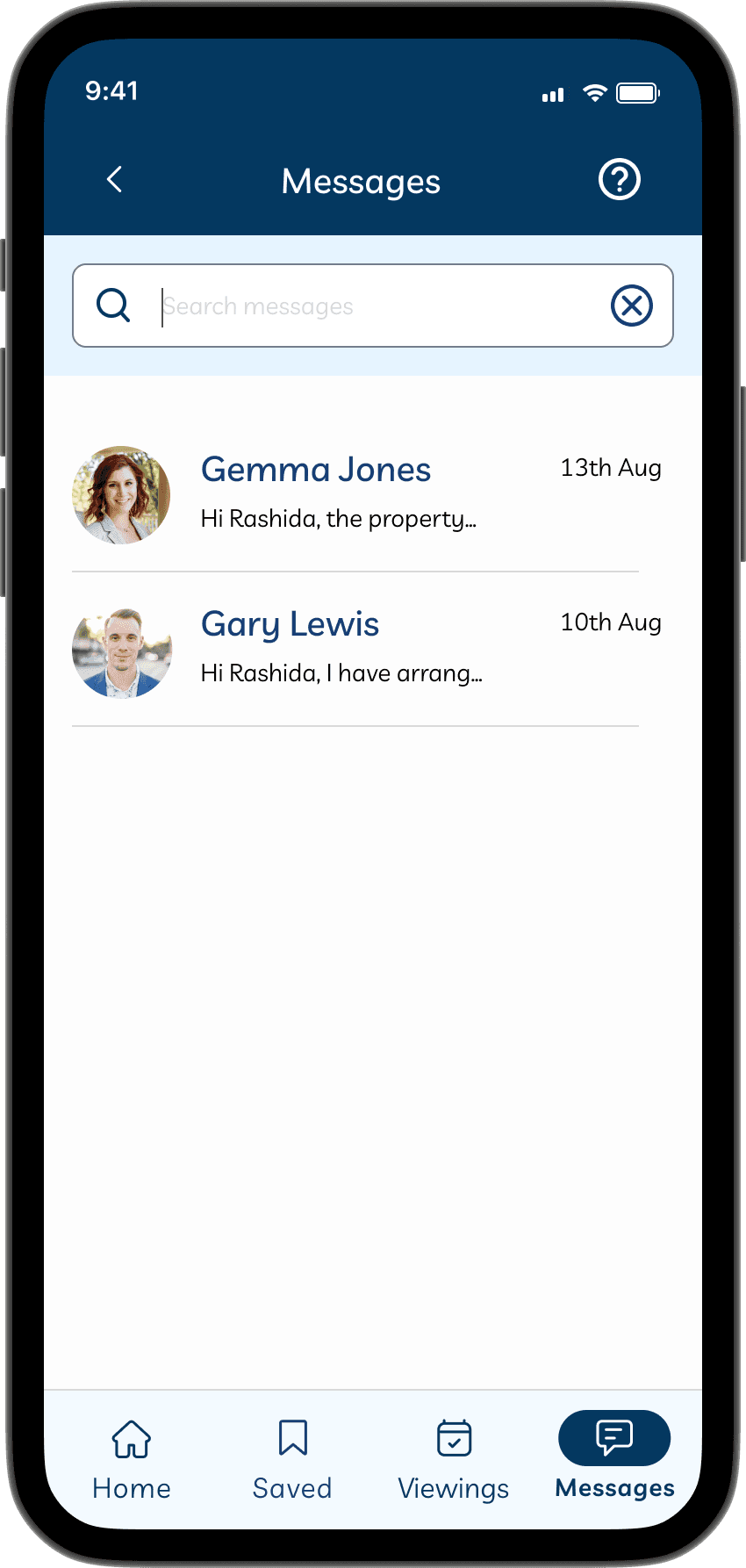
Using the style guide helped me design my high-fidelity wireframes more efficiently.
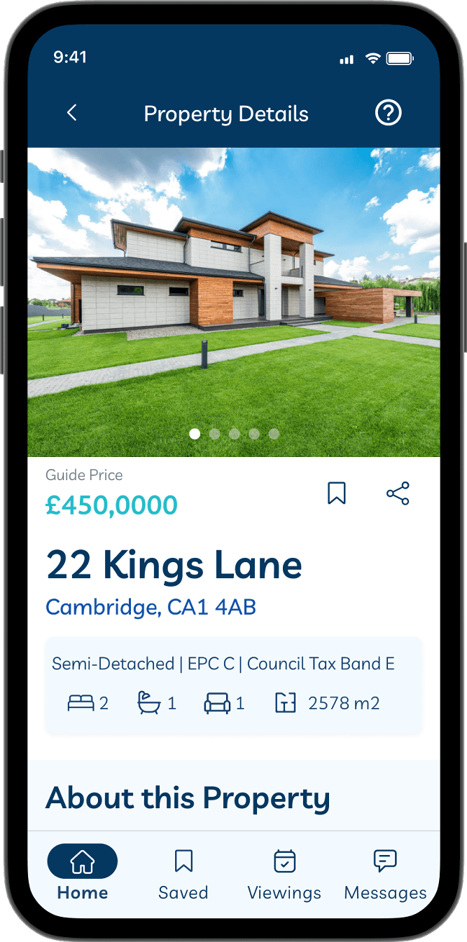
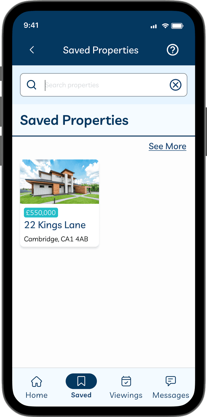
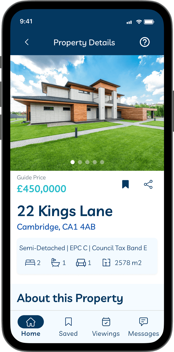
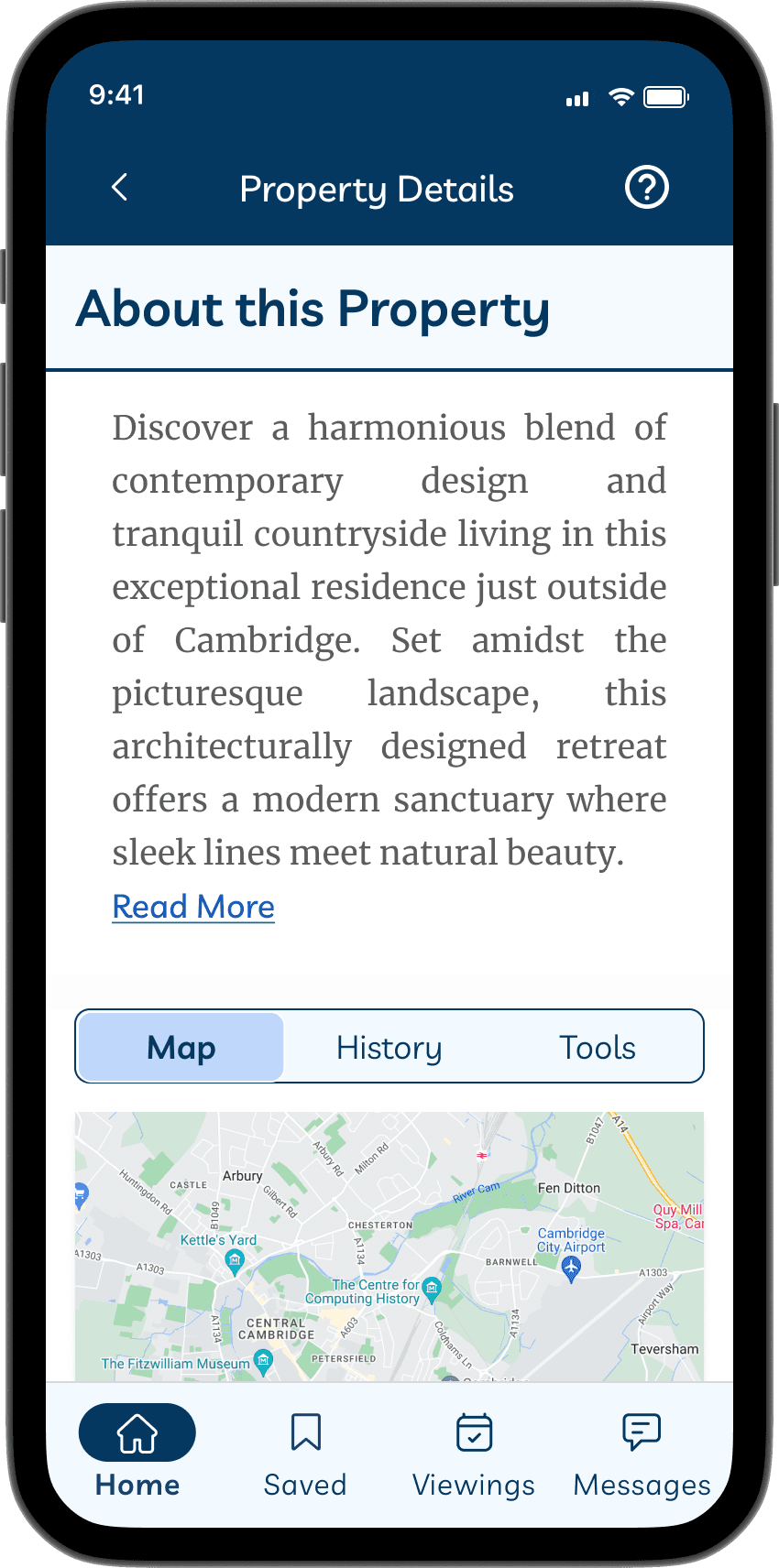
Saved Properties Page
Property Details
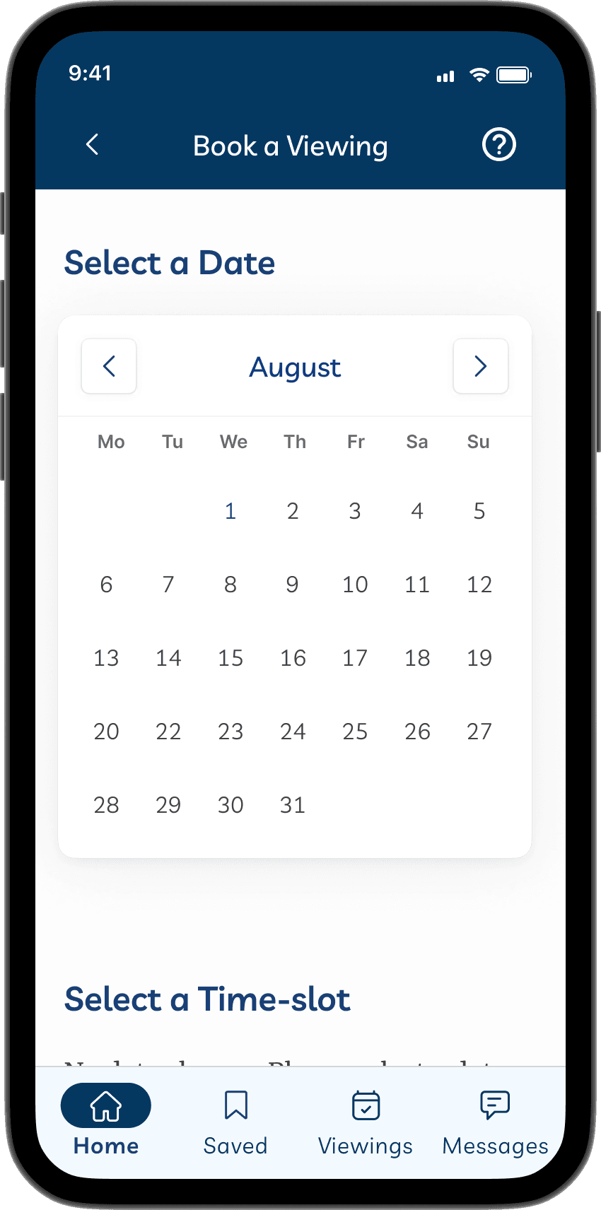
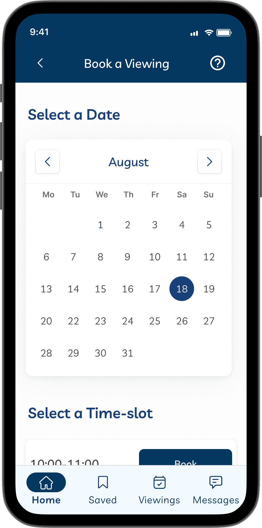
Booking Confirmation
Viewings Page
Book Appointment Page

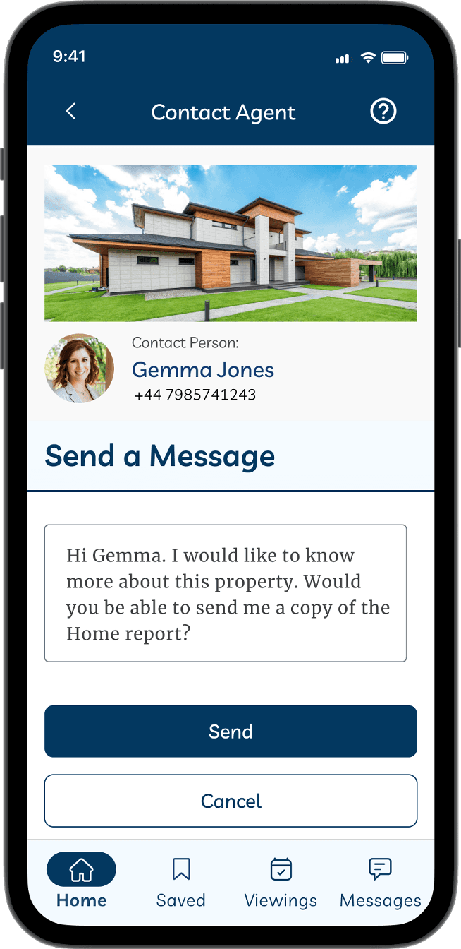
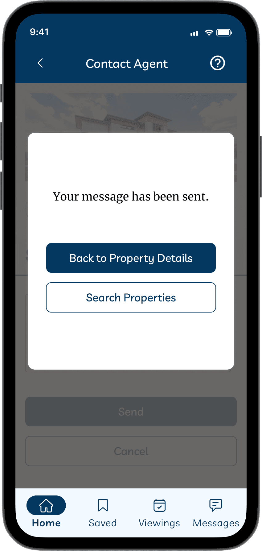
Message Confirmation
Messages Page
Contact the Agent Page
I’ve added a few micro-animations to give the users a real-feel while using the app. This helps give them feedback for certain actions executed such as clicking the buttons to fill-out forms, booking a viewing appointment or when choosing a specific area to search for properties.
Amazing
Homes
Log In
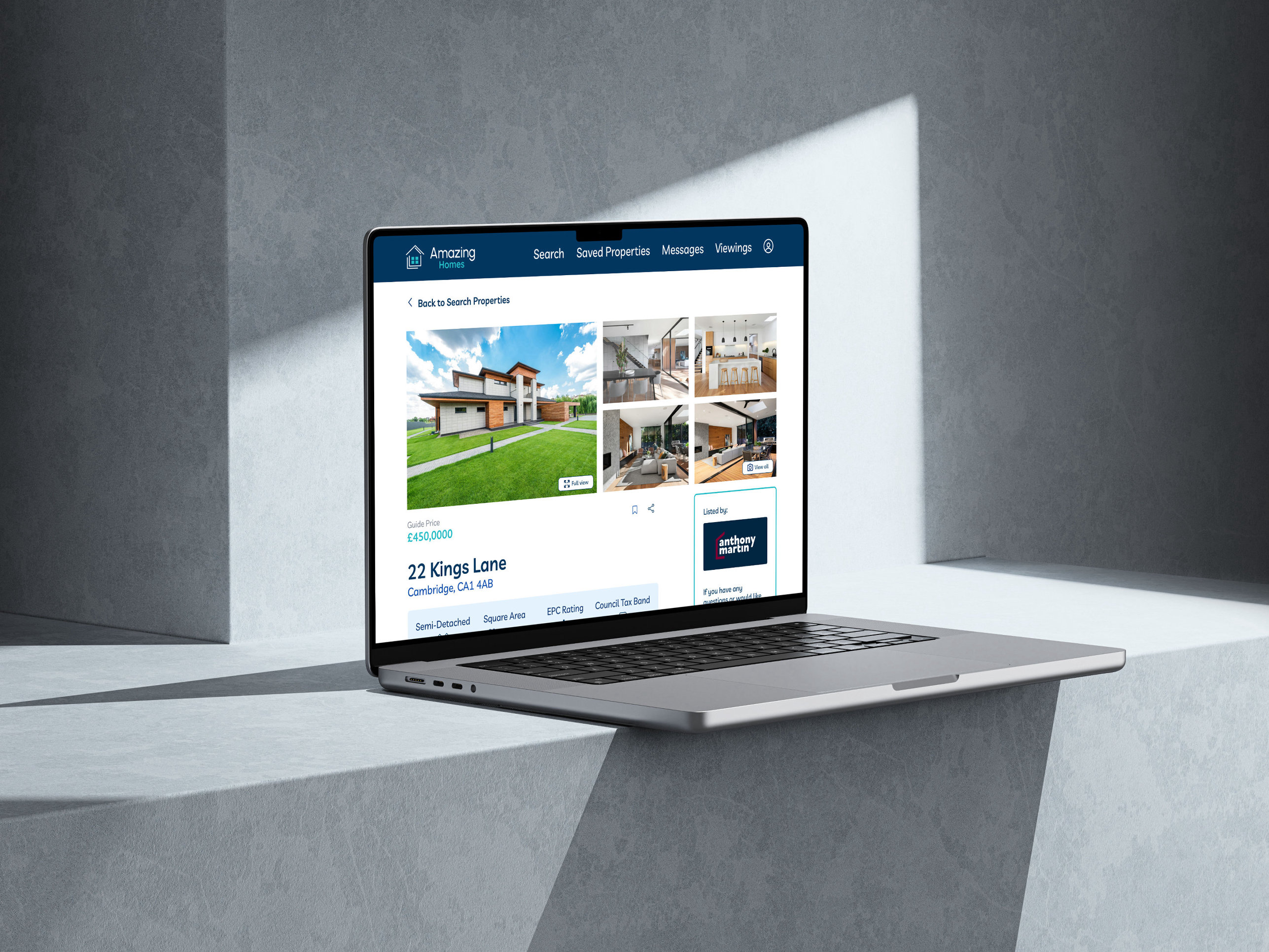
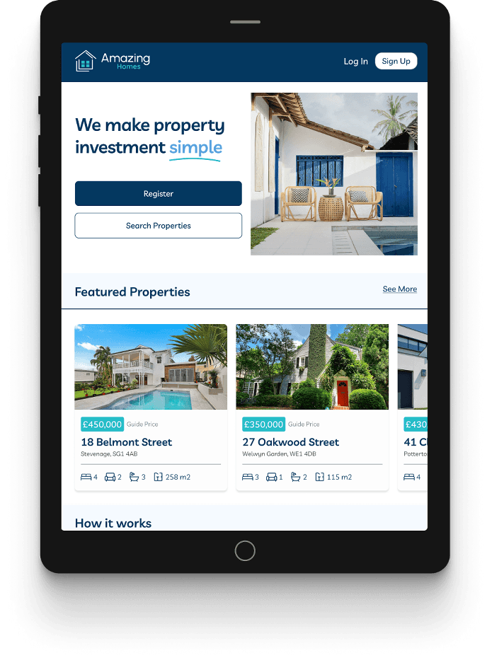
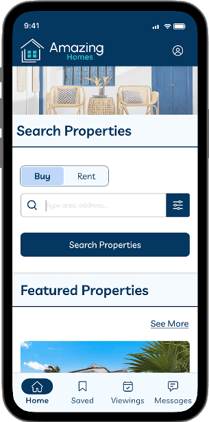
Going back to our user persona, it is evident that she spends most of the time doing important tasks using her mobile device. That being said, designing responsive web app will allow users to access the app on any device, most especially through their mobile phones.
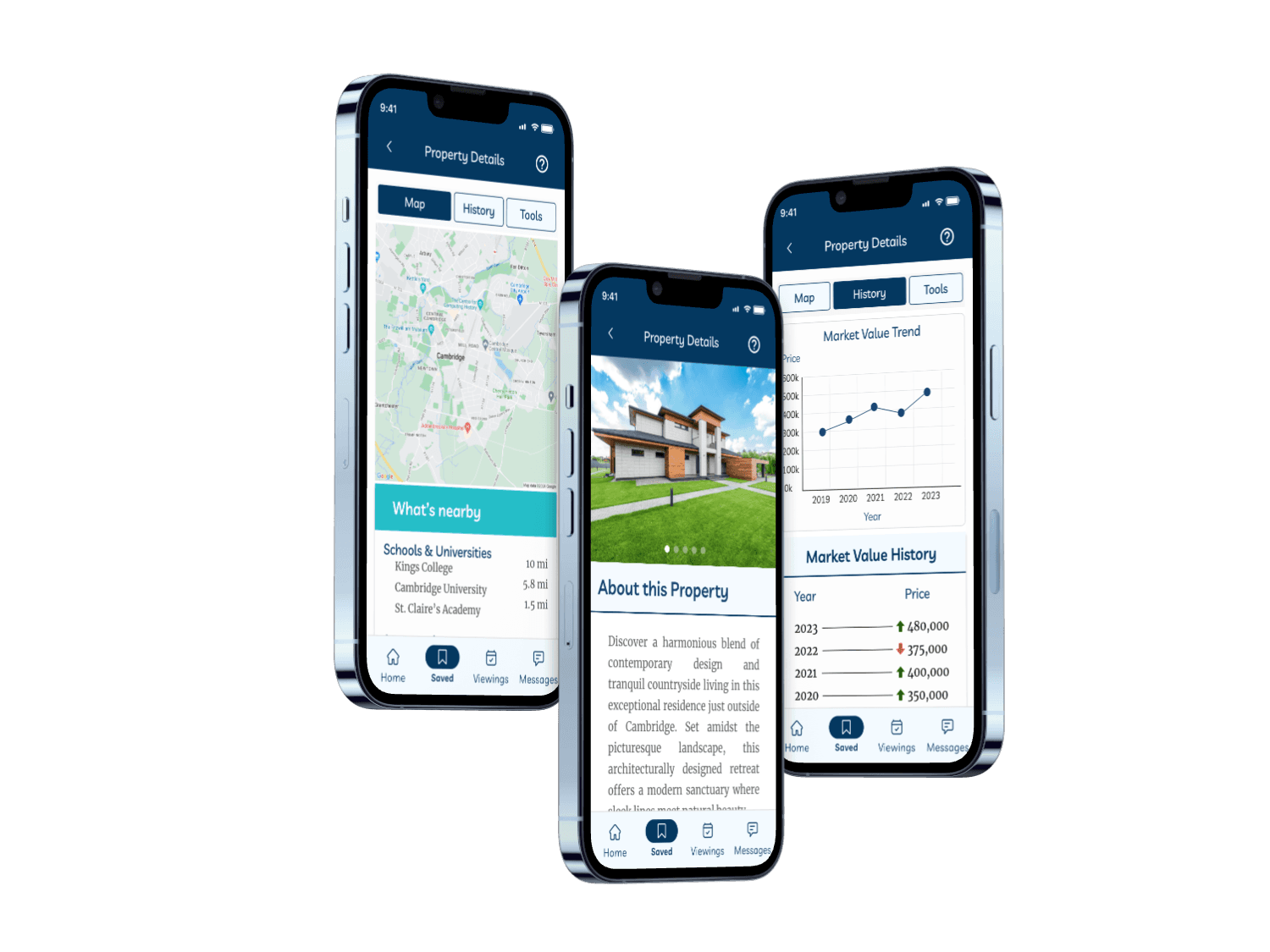
The most challenging part for me is how to fit bigger elements such as a row of images and squeezing in lot of text elements (copy) into a small frame without affecting the quality and readability. To solve this issue, I used a carousel so images can be swiped from left to right without the need to leave the current page. I also used tabs for easy accessibility especially if users are using mobile with just one hand.

I found it easier to design the medium screen breakpoint (tablets) since I get to have more space for the elements so I can fit more images and copy in a more reasonable size.
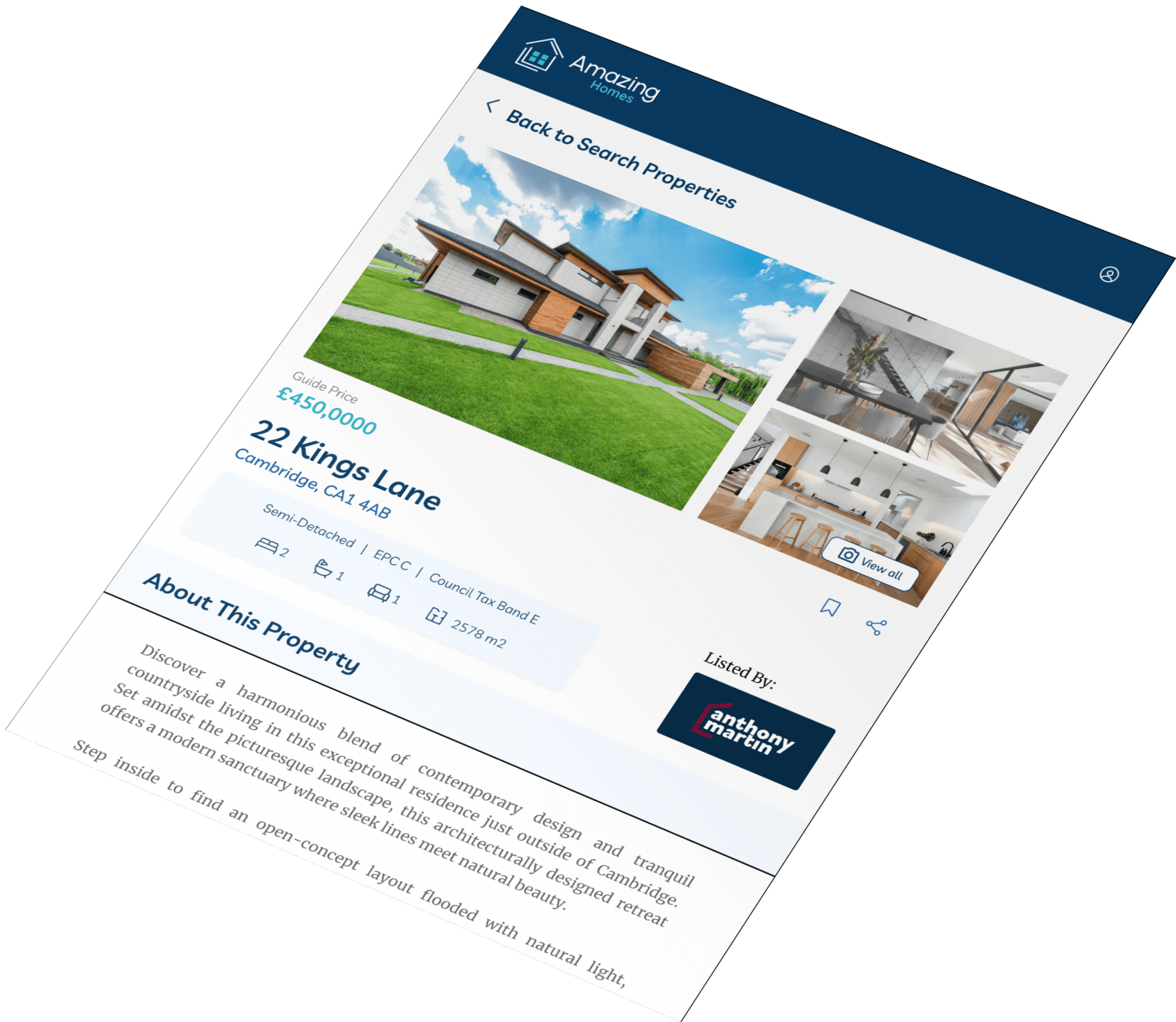
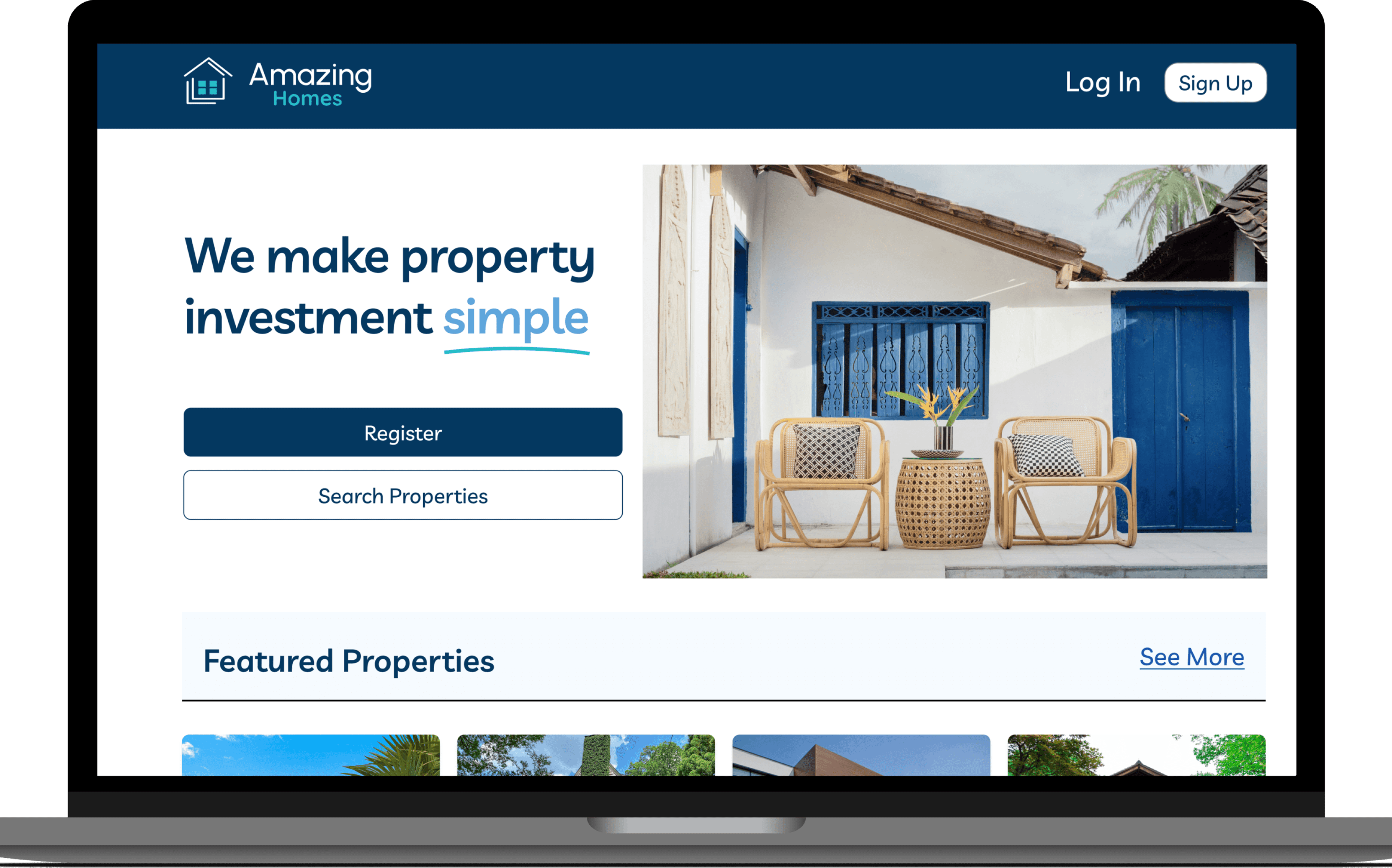
Lastly, I also found it challenging to design for a large screen, but I figured that you don’t need to use up the whole space. I made use of the white space wisely by adjusting the image sizes big enough to consume a certain amount of space but not too big that it looked stretched and overwhelming. There’s also a decent amount of space to fit all the important information in one screen.
Conduct more usability tests
Continue to iterate (there is no such thing as final designs)
Brainstorm on additional features and repeat the whole design process
Key Take-aways:
I have learned to systematise my work by creating and utilising the style guide. This made me work more efficiently and maintained the consistency of my designs.
Mobile-first is always the best approach when designing for a responsive web app. It’s easier to plan out the layout of the elements on a small screen as it gives you the freedom to play around with the space rather than trying to follow a design pattern from a bigger space and cramming you elements in a smaller device.
Designing a responsive web app is important nowadays so users can gain access to the app in any device, particularly on mobile phones.
