Wellness Circle
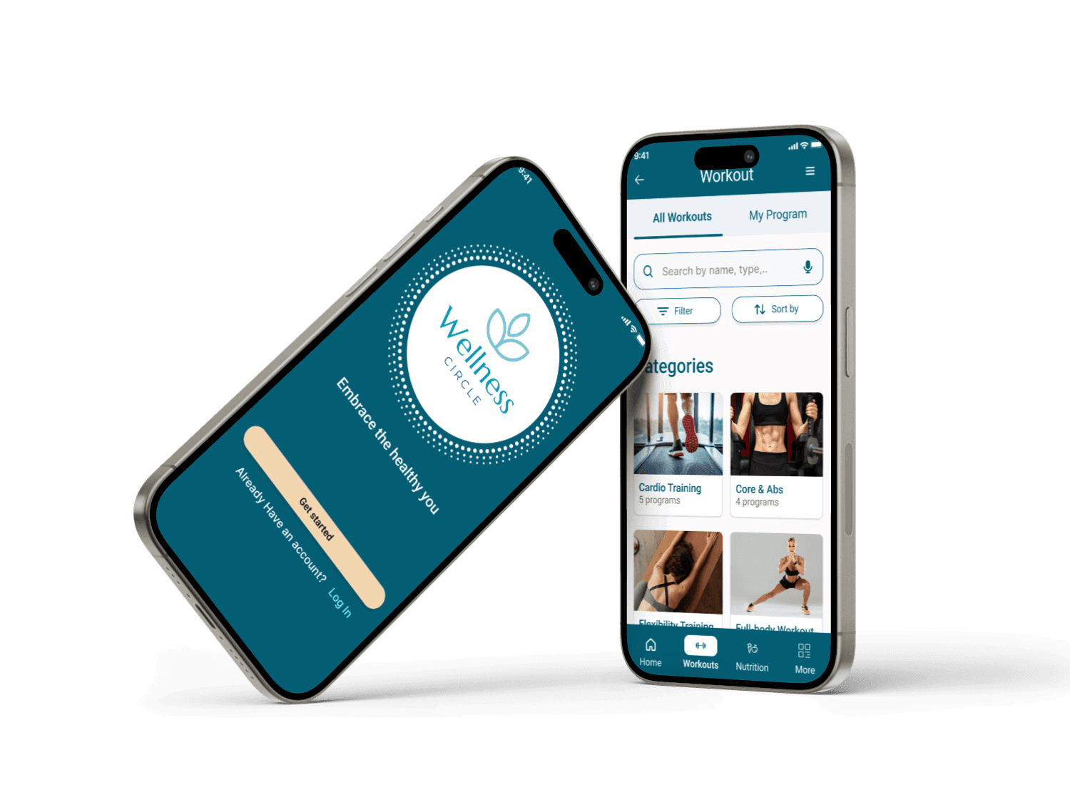
An all-in-one health app that empower users to efficiently manage their health with personalised fitness plans tailored to their specific goals.
Stakeholder:
Careerfoundry UX Design Project
Role:
UX / UI Designer
Duration:
7 months
Tools:

About the Project
The goal of this project is to design an app that would help busy and highly stressed people easily manage their health. The challenge was that there are already multiple health applications such as fitness, nutrition, mental health, and medical health. And that’s how Wellness Circle was realised.
Imagine one platform that eliminates the need for juggling various apps, providing a seamless, integrated experience that ensures users can effortlessly manage all aspects of their health journey in one place. Curious to learn about the process? Keep scrolling to know more. 😄
Responsibilities
User Interviews
User Personas
Userflows and Journey mapping
Sitemaps and Card Sorting
User / Usability Testing
Wireframing and Prototyping
Visual Design (UI)
Target audience
Busy health-conscious Individuals
Employees of organisations/ companies with highly stressful jobs
Problem
People with busy lives and stressful jobs struggle to prioritise their health.
They need a user-friendly app that not only simplifies health management but also offers personalised features, allowing them to tailor their well-being journey to their unique needs and schedules.
Solution
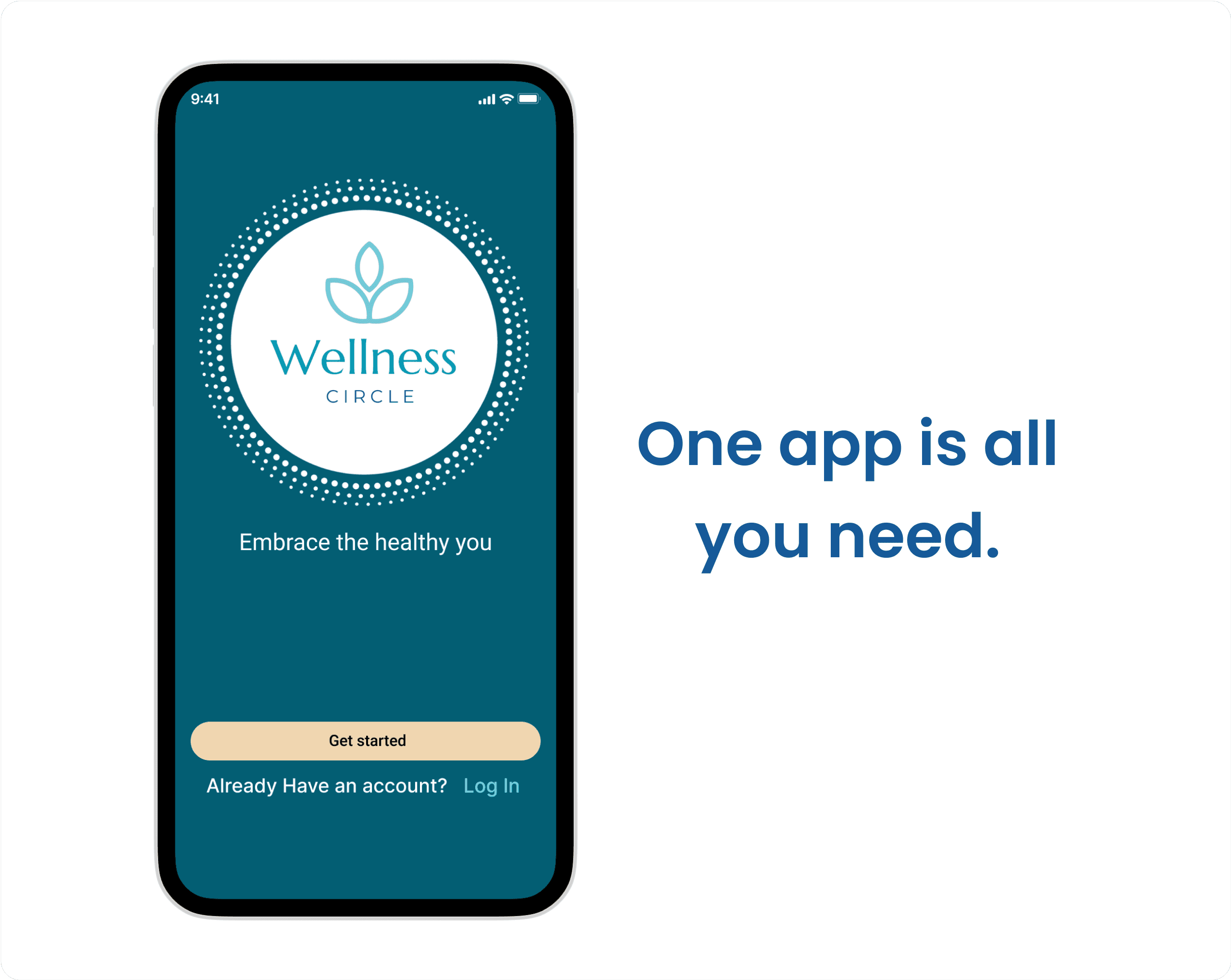
By creating an all-in-one app that provides a more holistic and personalised approach, it will empower users to take control of their health, while saving time, effort, and the frustration of navigating through multiple applications so they enjoy life more.
Success Criteria
The success of this app will be measured and validated through increased user engagement, demonstrated by longer average session times.
This can also be validated by user satisfaction surveys and positive app reviews.
Empathise
Part One
Understanding the user
Competitor Analysis
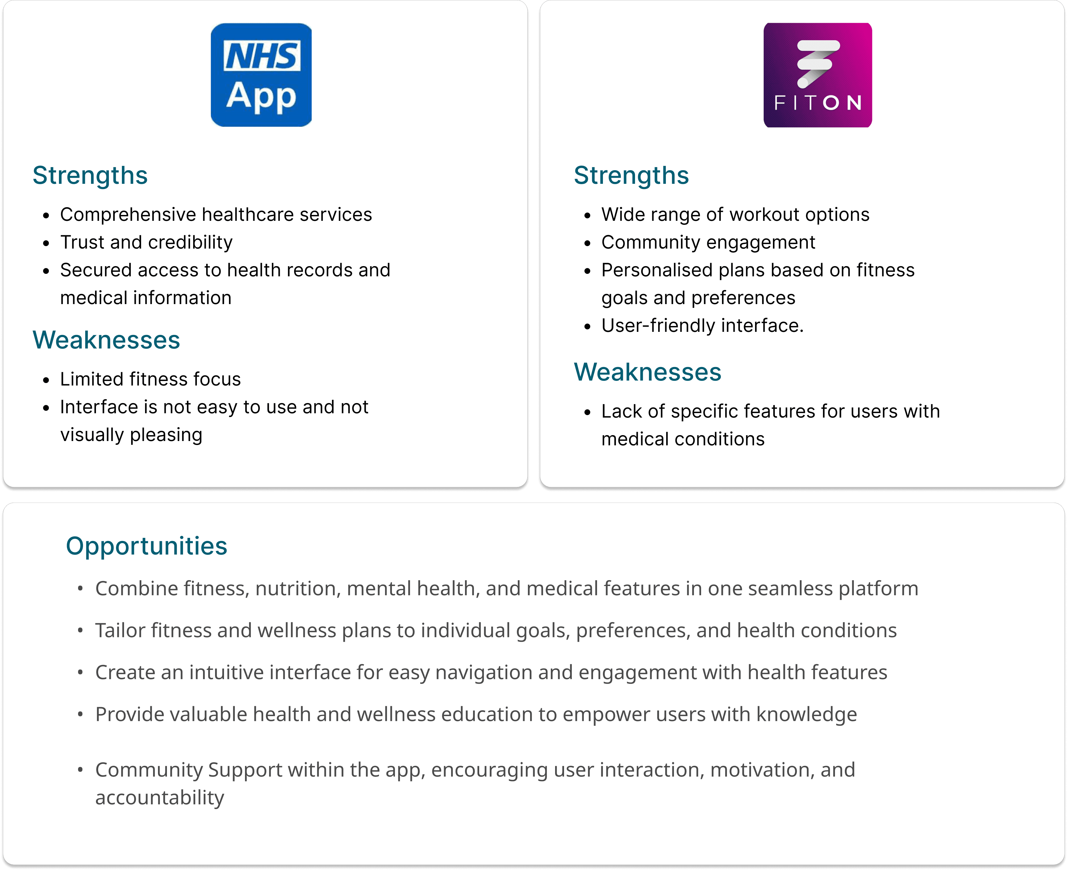
SWOT and UX analysis provided me with insights into my competitors' strengths and weaknesses and identified potential ways to leverage our app in the market. Based on our findings, NHS Apps’ focus is on medical and general health, while Fiton is on fitness and nutrition. By combining both features, it is possible to attract more users by developing an all-in-one app that meets all user needs.
User Interviews
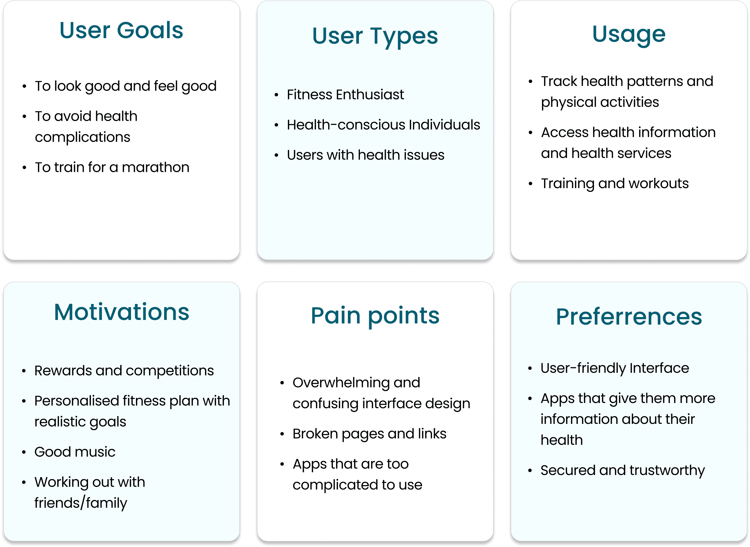
I interviewed three participants to assess their understanding of health apps and gain insight into their experiences using digital health tools. This gave me a clear understanding about their needs and goals, as well as behaviours, expectations and frustrations with health applications. Below is the summary of the key insights from my interview:
Define
Part Two
Defining the Problem
User Personas
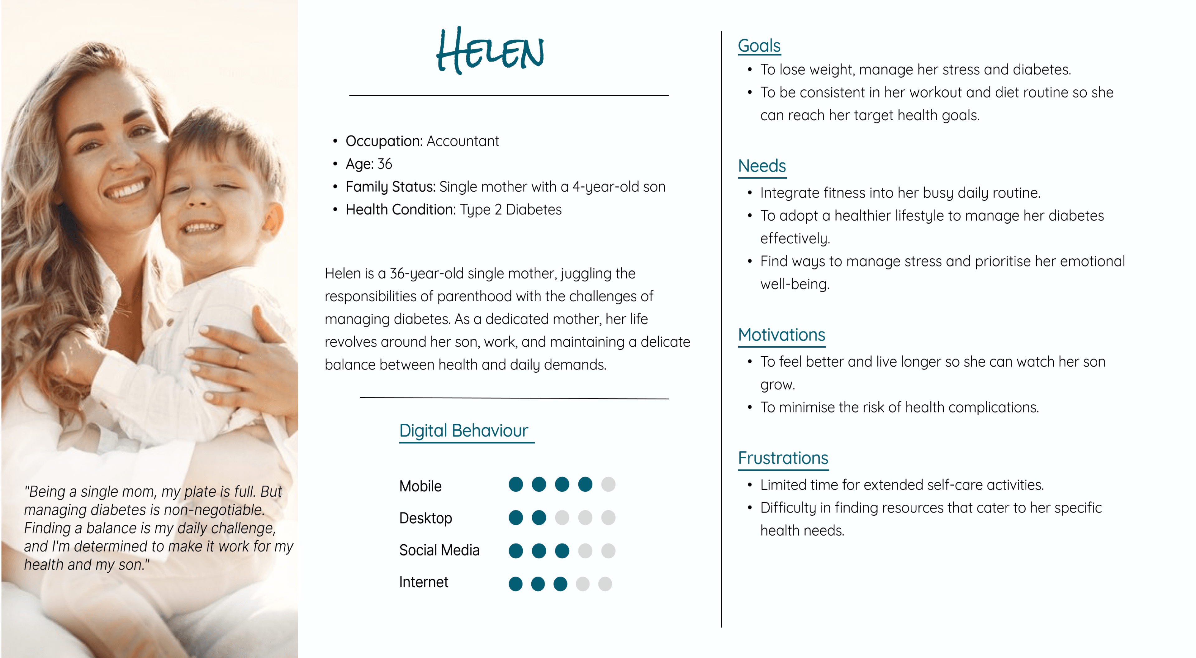
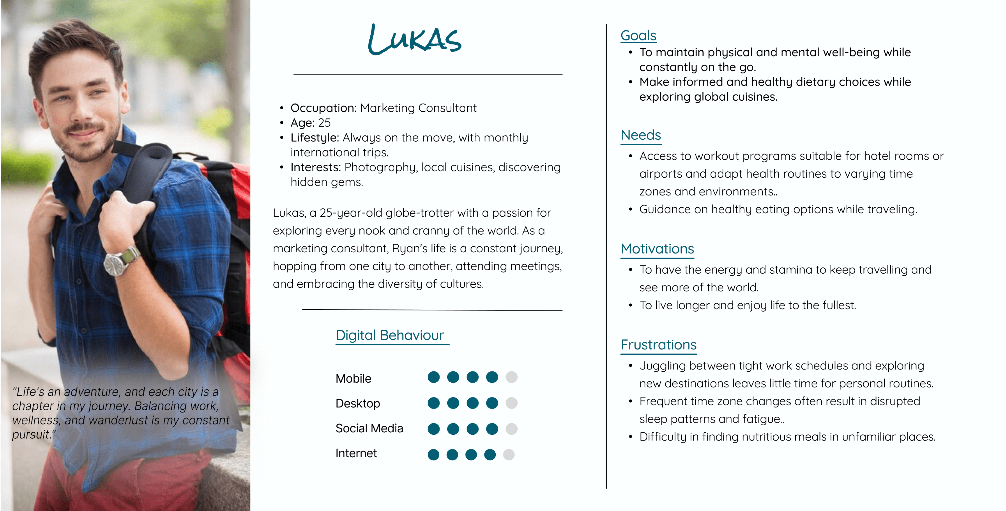
Using the insights I’ve learned from my research, I captured the true voice of our users through personas, Helen and Luke. These personas guided me throughout the design process to ensure that I prioritise features that matter most to the users.
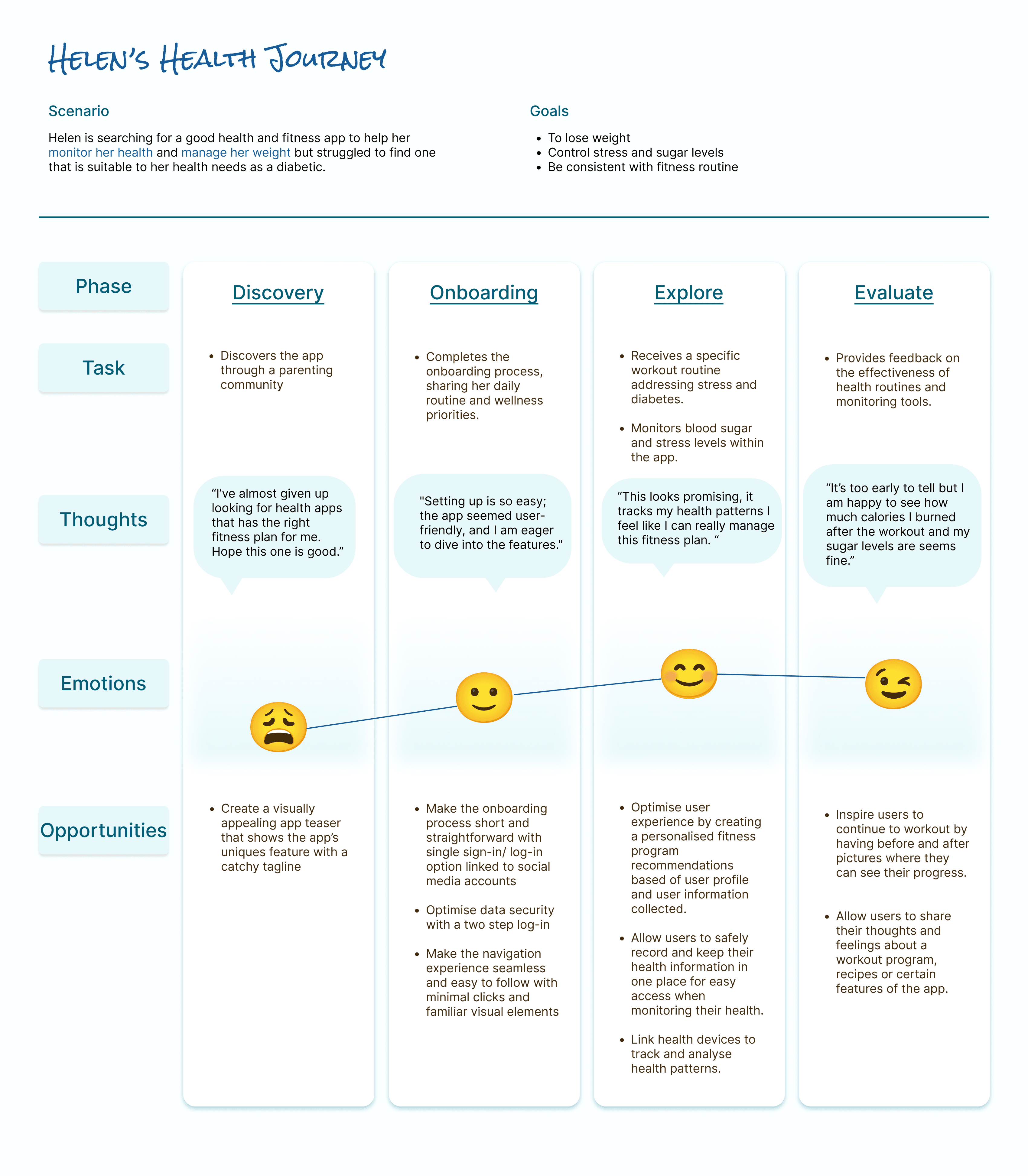
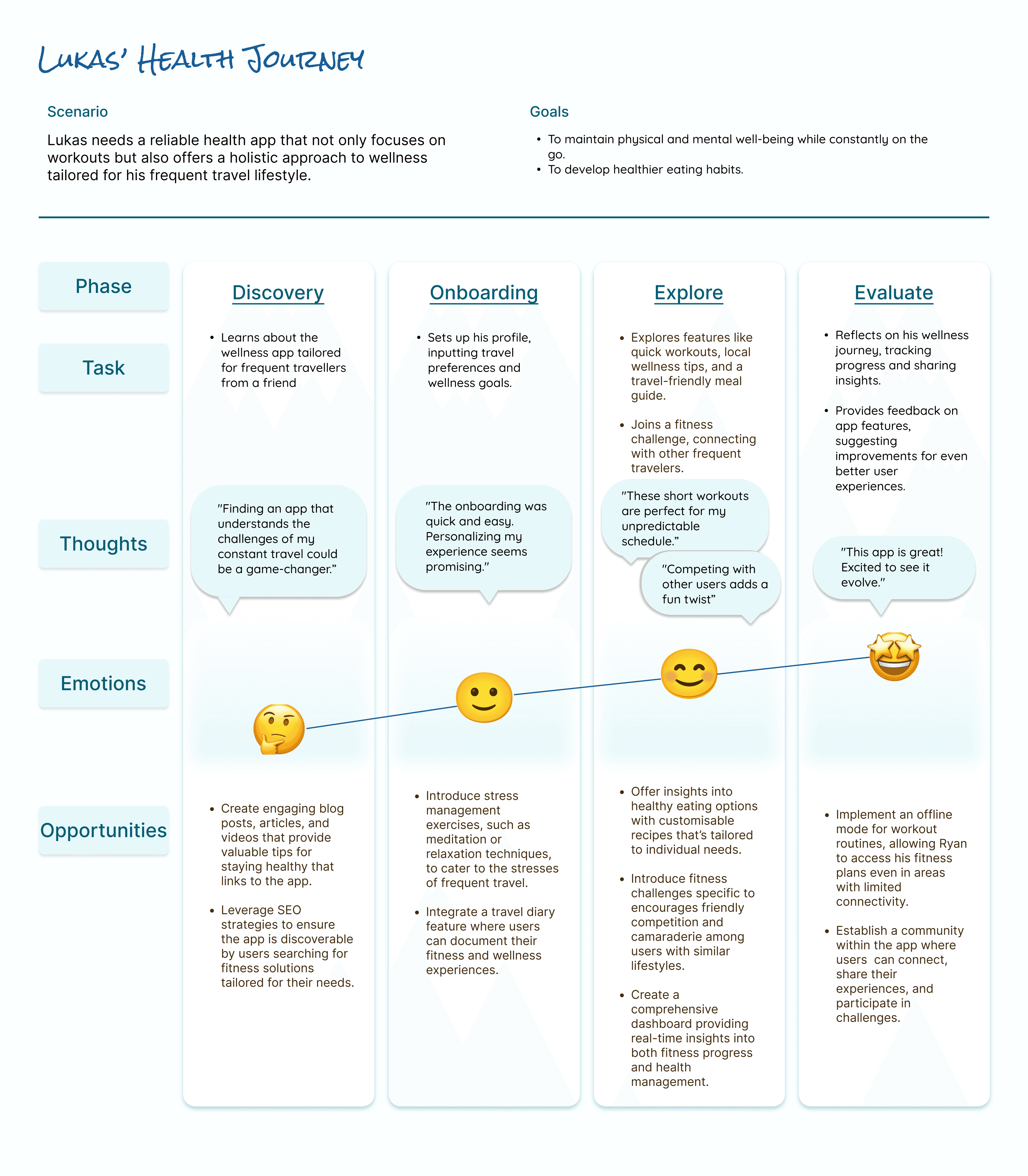
User Journeys
Guided by my personas, I identified the key touchpoints that users need to navigate in order to achieve their goals. This process enabled me to visualize their thoughts and emotions at each step of their journey.
Ideate
Part Three
Ideating Solutions
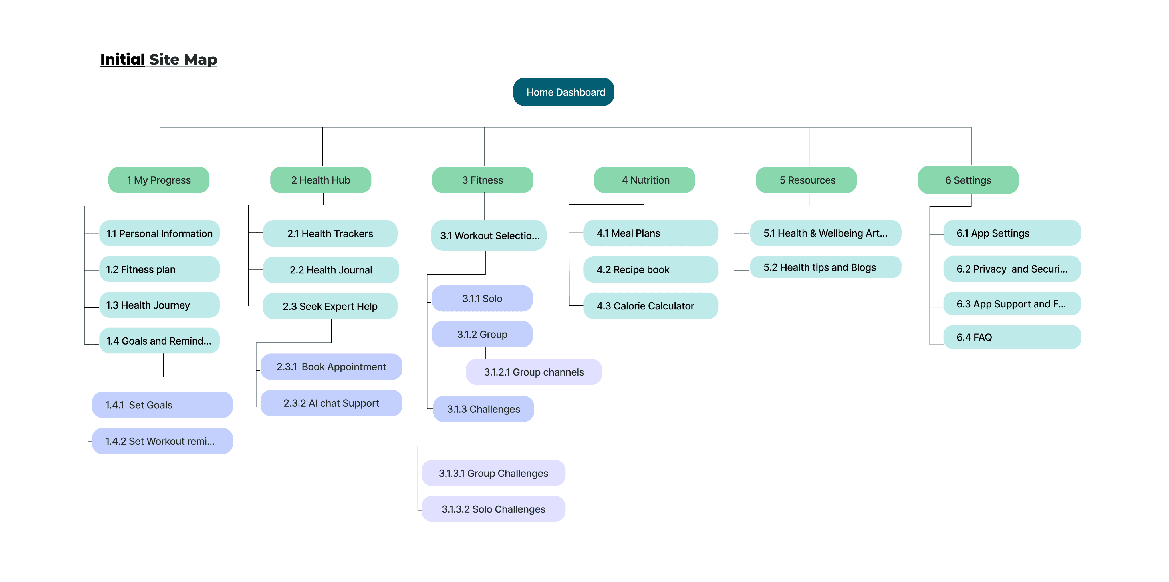
Information Architecture
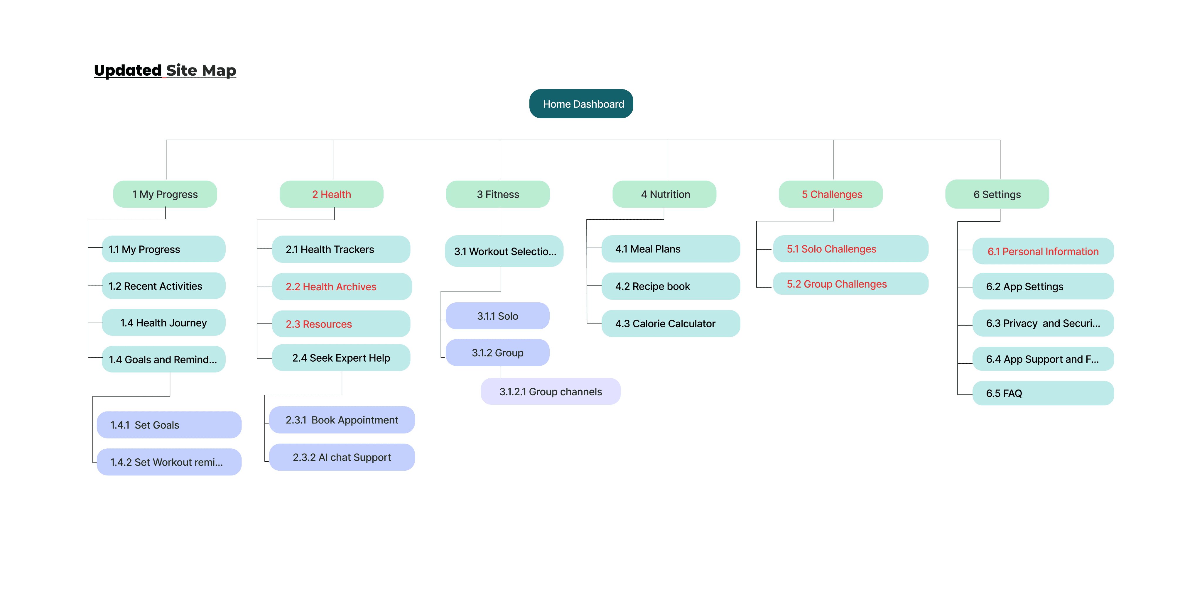
Next, I organised my data by creating sitemaps. I recruited 10 participants for an open card sorting activity online using Optimal Workshop. Results revealed that users arranged most of the cards in the same way that I did, while some were arranged differently due to confusion with the terminology used.
I re-labelled the confusing terms for clarity and re-arranged the order of the cards based on user feedback.
User Flows
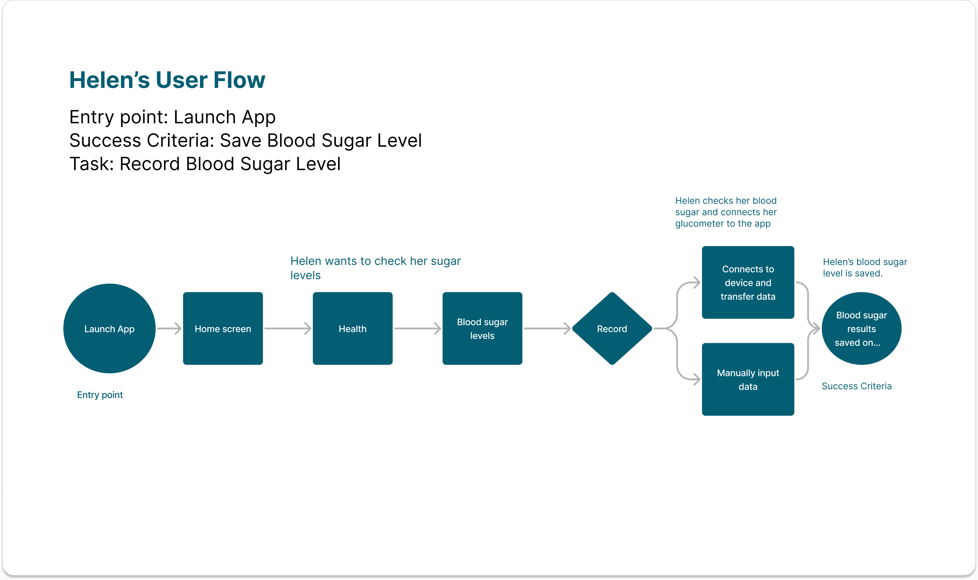
I referred back to my user research to identify the user goals and objectives. Then, I mapped out the steps that users may take to accomplish certain tasks. This helped me visualise how users interact with the app as they navigate through different pathways in order to accomplish the task.
Prototype
Part Four
Bringing Ideas to life
Wireframes
Using pen and paper, I started sketching out my ideas for the core features of the app. Once I am happy with the layout and structure, I started digitalising my sketches into mid-fidelity wireframes and prototypes.
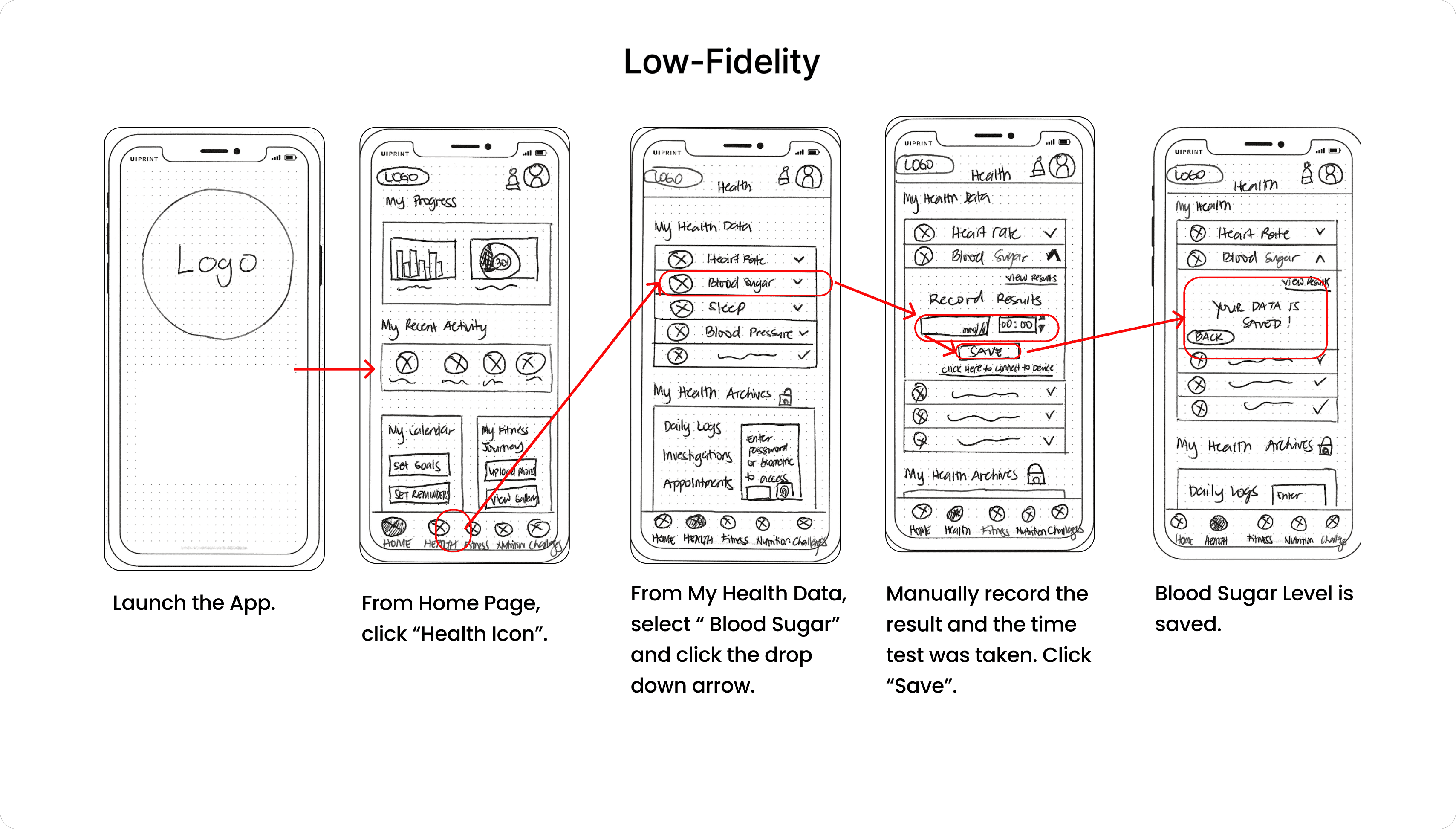
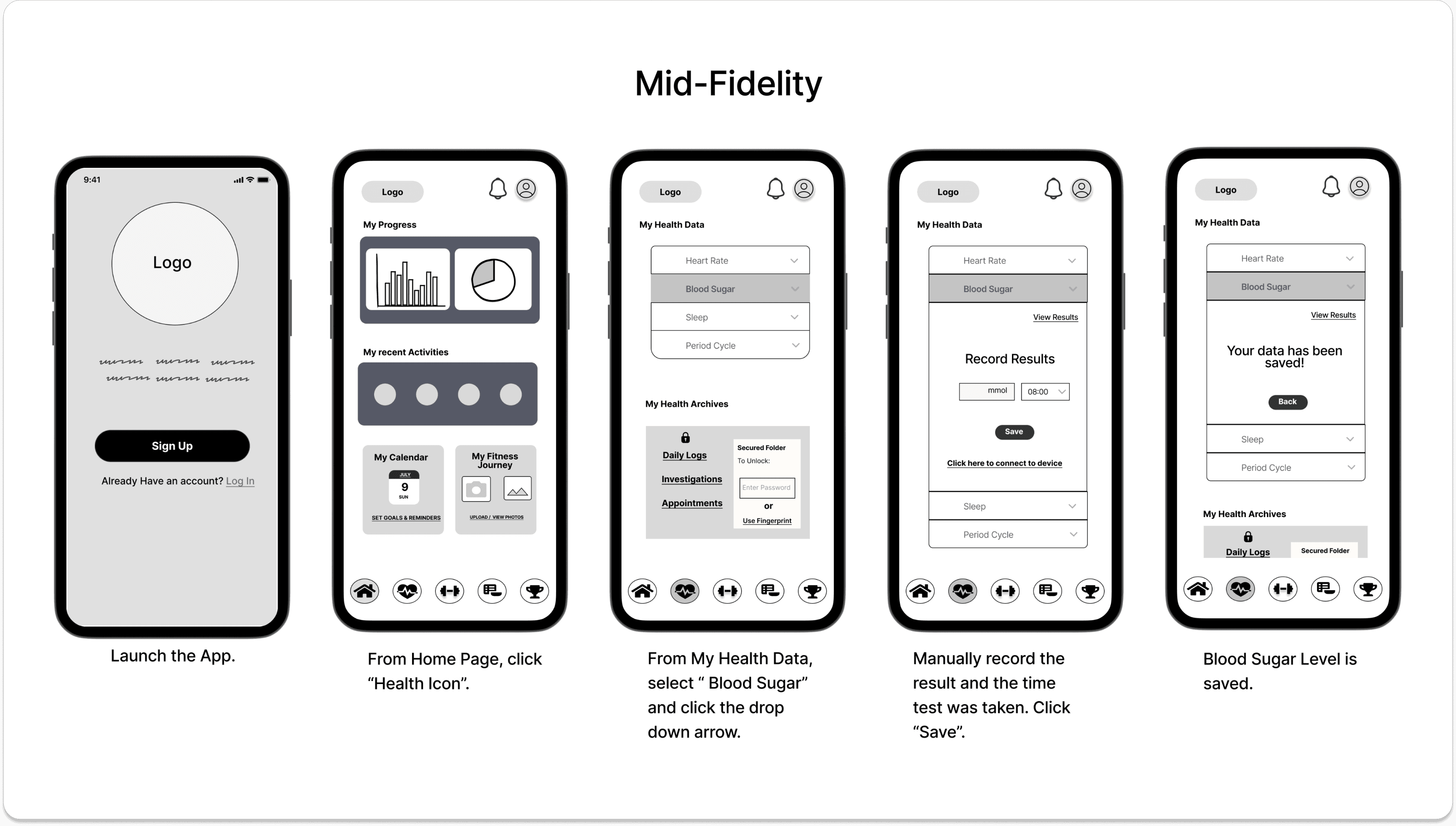
**Wireframe for Helen’s Userflow: Record blood sugar levels
Test
Part Five
Usability Testing
Usability Test Issues
I’ve asked 6 people to participate in a moderated remote usability test. This revealed the following issues:
No Back button on the next pages of the onboarding.(Medium Priority)
No other option but to take the quiz later if you skip. (Medium Priority)
Search and filter button not noticed/ not obvious. (High Priority)
Fitness Label is vague and causes confusion. (High Priority)
The back button on the nutrition page is in an unfamiliar place. (Medium Priority)
Issue 1:
No Back button on the next pages of the onboarding.
(Medium Priority)
Suggested Changes:
Add a back button on the next 2 screens of the onboarding.
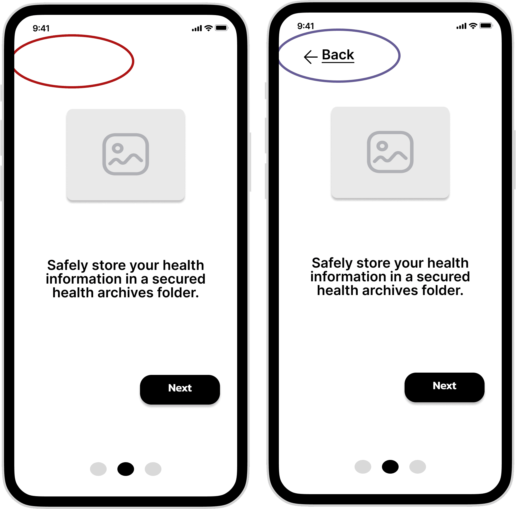
**Sample of the usability test issues identified
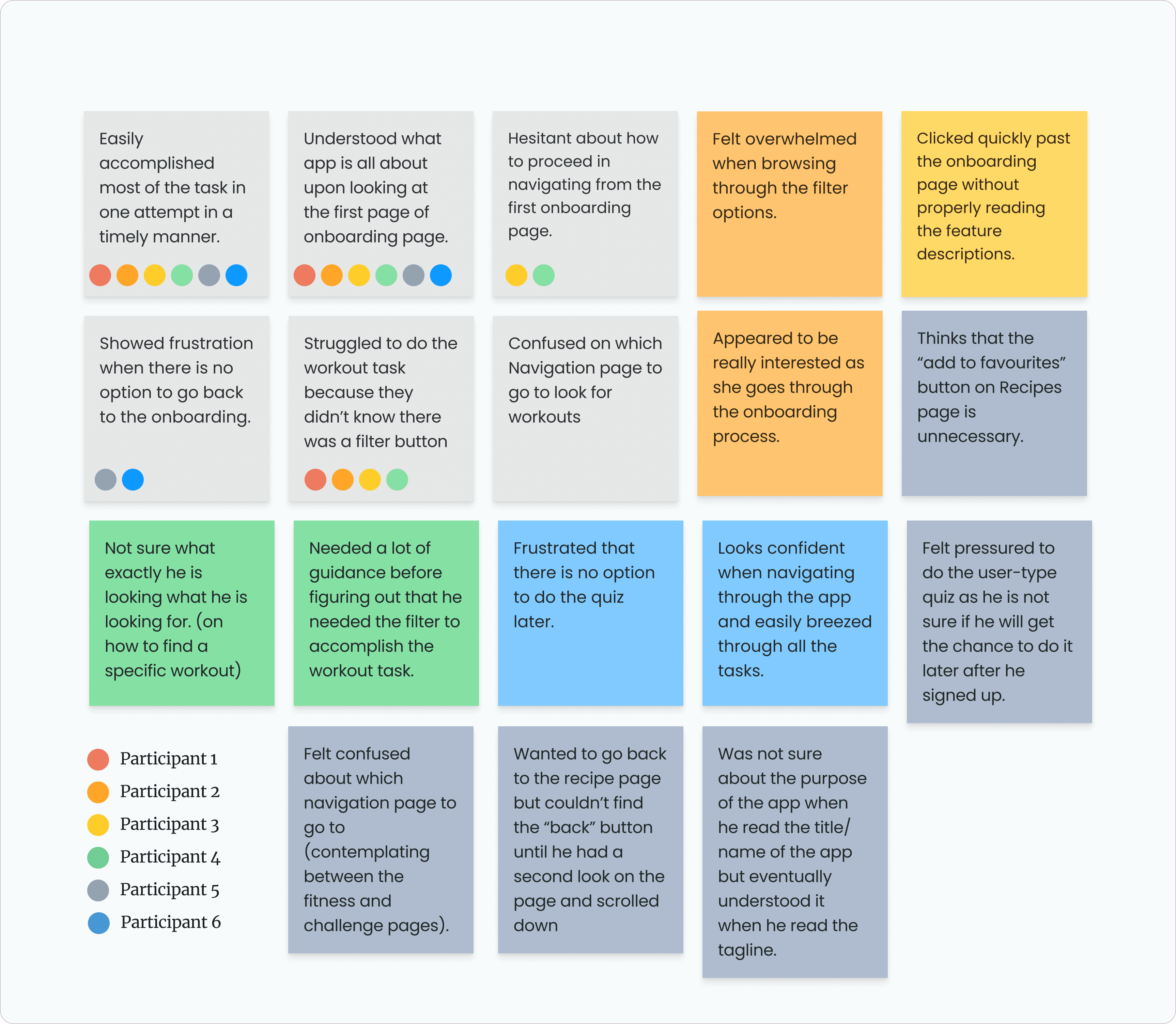
I recorded the users’ behavioural patterns as they interacted with the app and analysed my findings. Then, I used the Affinity diagram to gain insights into the data collected and referred to Jacob Nielsen’s Scale to prioritise the issues identified.
**Affinity Map Diagram: Observed behaviour
Style Guide & Design Iterations
After I implemented the necessary revisions for the usability issues identified, I applied the UI elements to my high-fidelity wireframes.
Colour Palette
035E73
165A99
736D6D
000000
F0D6B0
FFFFFF
E5F3FF
D6F1F6
CECDCD
Typography
Font Type : Roboto
H1
36
Semibold
Auto
H2
32
Medium
Auto
H3
28
Regular
Auto
S1
24
Medium
Auto
S2
20
Semibold
Auto
S3
20
Regular
Auto
C1
18
Regular
140
C2
16
Medium
20
C3
16
Italic
Auto
C4
16
Condensed Regular
Auto
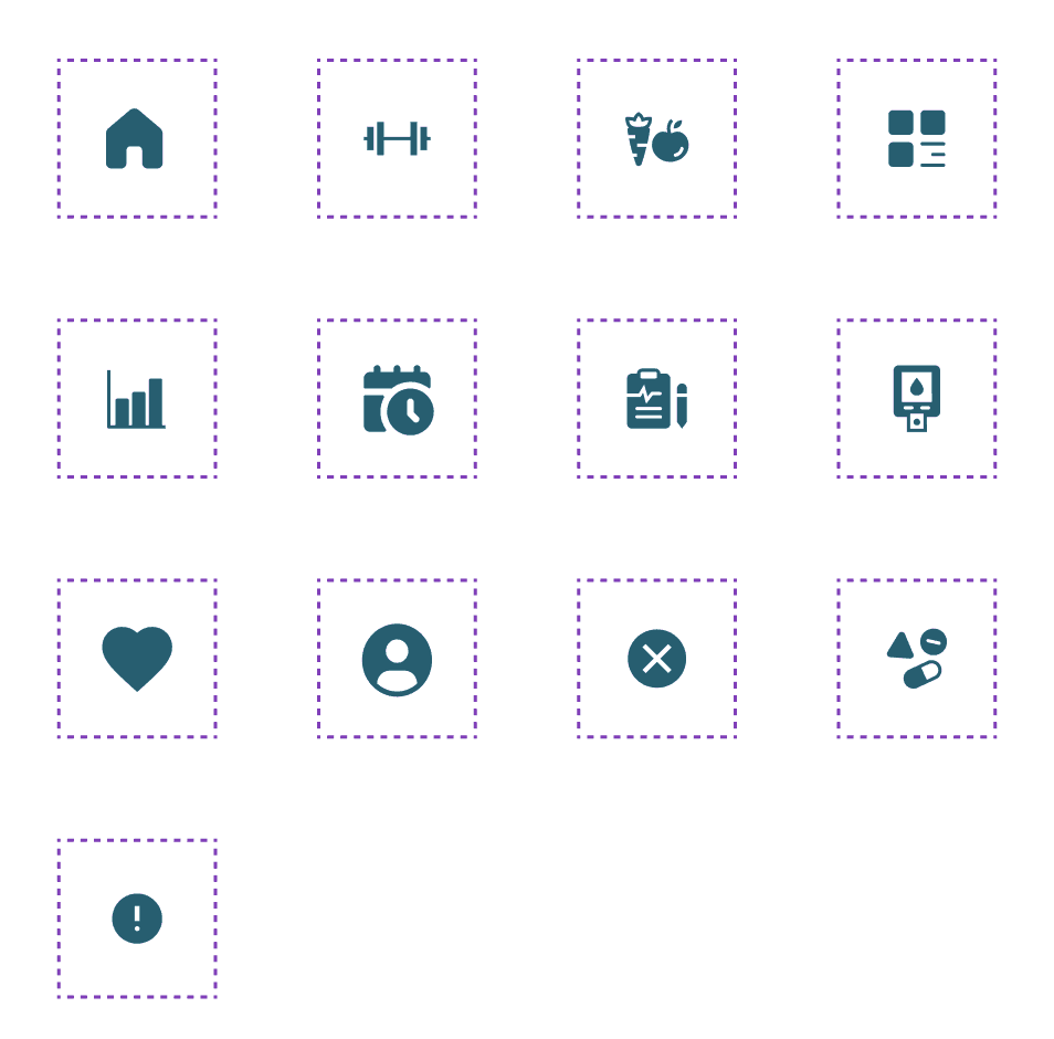
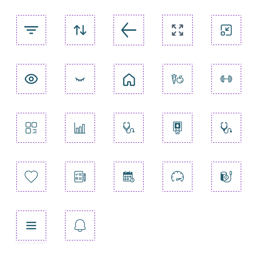
Icons
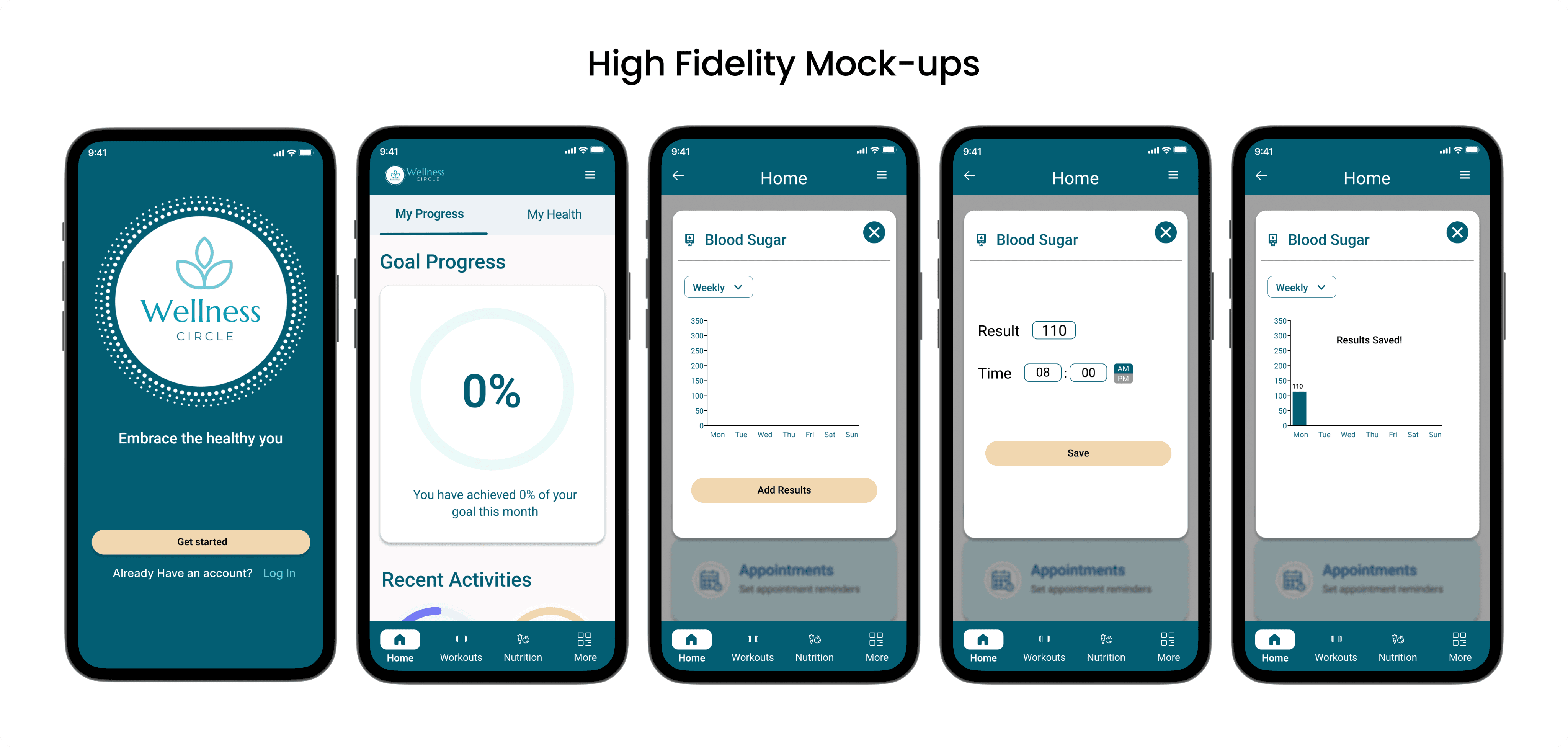
**Updated wireframe for Helen’s Userflow: Record blood sugar levels
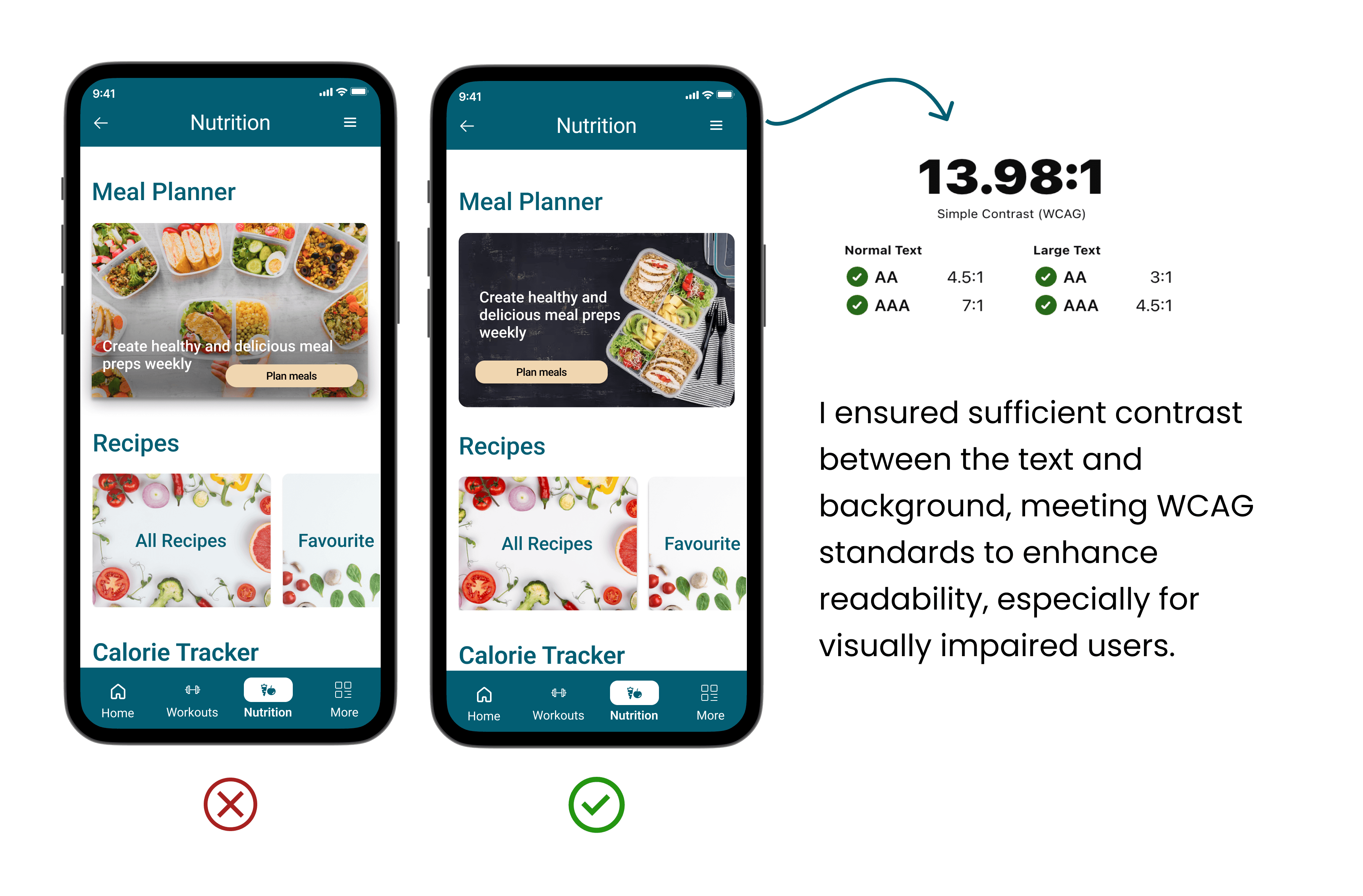
Designing for Accessibility
After UI designs were implemented, I sent out the high-fidelity prototype for peer review. I then implemented the changes based on feedback gathered, and made some adjustments for accessibility considerations.
Polished Design
Click the button to test the prototype.
Next steps
Create a new hypothesis for the next feature
Some users struggle to stay motivated after being in a fitness program for some time. Users need something to keep them engaged and commit to a fitness program to reach their goals.
Creating a merit system like milestone badges, adding feedback buttons for them to express how they feel about a certain workout program or recipes, and creating a community page where they can share their health and fitness journey with fellow users will help with user engagement, help them stay motivated, and keep the momentum going.
Validation
A series of user tests will be conducted to validate the hypothesis and iterations will be done in areas needing improvement.
Areas for Improvement
Improve the facade of the sign-up/ login page and make it more appealing while maintaining the simplicity of the design.
Add a few micro-animations to the onboarding page for a more enhanced user experience.
Add more features that users would find valuable/useful and that would also be a potential business opportunity (e.g., a shopping feature where users can buy workout accessories or subscribe to meal plan deliveries).
Timeline
2-3 months
Key Learnings:
Asking the right questions is very important to fully understand the needs and goals of the users.
Don’t try to solve all the problems. Learn to prioritise.
Rectify identified issues early on, otherwise, it can cost more time and effort in the long run.
Applying the Design Principles and Material Design guidelines in my prototypes helped me create better designs that meet the needs and expectations of my target users.
There is no such thing as perfect design. There will always be room for improvement. Do not get stuck trying to perfect your design, make it good enough and move on to the next task.
Design is an iterative process and we need to keep iterating to adapt to our users' changing needs and goals.
Be open to criticisms and constructive feedback and use it as a guide to make better design decisions.
